WOW... it has been a long time since I posted anything to my blog. And it is not because I haven't been creating things. I've been working on cards mostly and sometimes I just think they may not be worth the time to take a picture and post to the blog. I think I'm wrong about that and should be posting more of my everyday stuff... so here we go.
This is a building block card. No, I didn't come up with this unique card fold ... I found it in on Split Coast Stampers website.
First, let me tell you that the heart shape filled with smaller hearts is a die cut. My friend Mary was over last weekend and brought her new dies for us to see and had die cut several of them using white cardstock for us to have. Mary also provided the multi-colored scrapbook paper that I used behind the heart die.
On the front of the blue card I placed strips of purple and orchid scraps that I had available, and before attaching them I ran them through the cuttlebug using 3 different cuttlebug embossing border folders.
Inside the card you can now see the 4 'blocks' that give the card its name. Using my scor-pal first to score the lines that will create the blocks, I then used a craft knife and a steel edge ruler to cut them. I did cut orchid pieces of card stock to cover each side of the 4 blocks before attaching the letters I die cut using a cuttlebug alphabet set. I stamped a couple of hearts, an arrow, and the word love that are from a Stampin Up stamp set I've had forever.
Here's another look at the card opened up from a different angle.
Here is a link to the Split Coast Stampers website so you can read their tutorial on this card if you wish..
http://www.splitcoaststampers.com/resources/tutorials/buildingblockcard/
It wasn't difficult to do... try it!
Before I attempted the card, I used a piece of plain white card stock to ensure I would understand the instructions for creating this card. I'll save that white card as a template to help me if/when I make another of these cards
And here is another picture of just the inside of the card. This style card would be great for a 'get well' card also since the number of letters fit well with the number of blocks on the inside of the card.
It's time for a change; it's time to grow. This blog is one step that will encourage me to explore, experiment, and share my journey. But the primary element in my growth is the inspiration of my talented friends.
Showing posts with label cards. Show all posts
Wednesday, February 12, 2014
Monday, August 26, 2013
Get well for a 'furry friend'
A friend of mine requested a special card. Their son's golden retriever, Gibson, will be having ACL surgery in the fall. So my friend asked if I would create a get well card for Gibson. She gave me a picture of Gibson to use, but I found some other pictures on the internet that worked well with my idea.
Gibson is a reddish golden retriever so these pictures worked perfect for the theme of my card. I did try finding pictures of a dog with its leg in a cast, but I didn't really like any that I found. I think this idea with the 'cone' is a much better one.
I hope my friend likes the card. If she doesn't I'll make her another and keep this one for myself. I'm sure I will be able to find a use for it since it isn't specific about what type of health issue the dog has.
I love challenges like this... and love making dog cards.
Gibson is a reddish golden retriever so these pictures worked perfect for the theme of my card. I did try finding pictures of a dog with its leg in a cast, but I didn't really like any that I found. I think this idea with the 'cone' is a much better one.
I hope my friend likes the card. If she doesn't I'll make her another and keep this one for myself. I'm sure I will be able to find a use for it since it isn't specific about what type of health issue the dog has.
I love challenges like this... and love making dog cards.
Tuesday, February 5, 2013
Clock themed purse and gift card set
I feel good now and can move on to some other projects. I finished the last set of gift cards and matching purse (card holder) that I was working on. This double sided scrapbook paper is one of my favorites. I've made a gift card set with the same paper a while ago.
Here are a front and side view of the purse. I'm sure the ribbon I used was a leftover from some gift I received a while ago, but it worked well with these colors.
The left side is a piece from the scrapbook paper and the right side piece is from another packet of clock-themed paper I have. I simply placed a brown ribbon down the center where the 2 pieces meet. The 'Time' was stamped and then cut with a spellbinders die.
For the other card I cut out one of the clocks from the scrapbook paper and again used a piece of paper from a Bo-Bunny packet as the background layer. A friend of mine has the Tim Holtz clock die and months ago we cut out several of them. I found the die cuts hiding in my stash and thought it would work well with one of these cards.
On the left I ran a layer of burgundy card stock through the cuttlebug with the sizzix 'pocket watch' texture fade. Then, using my finger, I applied metallic rub ons to the embossed surface. A piece of the scrapbook paper covers the bottom half of the card with some decorative ribbon attached where the 2 pieces meet. The phrase is from a Tim Holtz Stampers Anonymous set that I cut with a spellbinders die after stamping on a piece of card stock.
The right side card is simply cut from the scrapbook paper, layered on black, and then placed on a burgundy card. The phrase was stamped and then cut with a spellbinders fancy tag.
I also found some '7 gypsies' paper that I had to use with these cards. Each of these cards is using some of that paper to compliment the scrapbook paper I was working with. The words I used on both these cards come from a set by Cornish Farms. And once again I used spellbinders dies to cut and layer the words I stamped for the cards. The little corner embellishments are small square and round pieces that I've had for a long time. I don't even know where or when I got them.
This card uses a sizzix texture fade called 'steampunk'. It came in the package with the 'pocket watch' texture fade. Seeing the gears gave me the idea to attach the 'gears' in the upper right corner. Those metal pieces were found in the jewelry area of Michael's. One package of them includes a whole bunch of both large and small gears.
The words stamped on this card are from a set from Stampers Anonymous.
I attached a very thin decorative ribbon where the scrapbook paper meets the embossed layer.
The decorative edge on the top card was created with an EK Success border punch. I attached a thin ribbon down the right side also. I used corner punches on the 2 left side corners and added a gold brad for a little color. It may be difficult to see, but there is a clear sticker on both of the cards. I've had these stickers forever in various sizes and decided it was time to use them.
The right side of the bottom card uses a piece from the Bo-Bunny pack I have that matches this scrapbook paper so well. The 'time' stamp is from Stampers Anonymous. It is stamped on the Bo-Bunny paper and then layered on gold metallic and brick red paper. The decorative ribbon is attached where the 2 decorative papers meet. A decorative corner punch was used on the 2 right side corners of this card.
And here are the first 2 cards I made when doing this batch of cards. Both of these cards have a layer that is from a core'dinations pack. I ran both through the cuttlebug. On the left I used the 'pocket watch' texture fade and on the right I used a cuttlebug embossing folder. Each piece was then sanded so that the core of each paper could be seen. Just a corner of the scrapbook paper was attached in the left lower corner of the cards and then each was embellished. On the left I ran a ribbon through a buckle that was created with a spellbinders die. On the right I used the EK Success border punch to create a decorative piece that was attached to the top of the card.
Here are a front and side view of the purse. I'm sure the ribbon I used was a leftover from some gift I received a while ago, but it worked well with these colors.
The left side is a piece from the scrapbook paper and the right side piece is from another packet of clock-themed paper I have. I simply placed a brown ribbon down the center where the 2 pieces meet. The 'Time' was stamped and then cut with a spellbinders die.
For the other card I cut out one of the clocks from the scrapbook paper and again used a piece of paper from a Bo-Bunny packet as the background layer. A friend of mine has the Tim Holtz clock die and months ago we cut out several of them. I found the die cuts hiding in my stash and thought it would work well with one of these cards.
On the left I ran a layer of burgundy card stock through the cuttlebug with the sizzix 'pocket watch' texture fade. Then, using my finger, I applied metallic rub ons to the embossed surface. A piece of the scrapbook paper covers the bottom half of the card with some decorative ribbon attached where the 2 pieces meet. The phrase is from a Tim Holtz Stampers Anonymous set that I cut with a spellbinders die after stamping on a piece of card stock.
The right side card is simply cut from the scrapbook paper, layered on black, and then placed on a burgundy card. The phrase was stamped and then cut with a spellbinders fancy tag.
I also found some '7 gypsies' paper that I had to use with these cards. Each of these cards is using some of that paper to compliment the scrapbook paper I was working with. The words I used on both these cards come from a set by Cornish Farms. And once again I used spellbinders dies to cut and layer the words I stamped for the cards. The little corner embellishments are small square and round pieces that I've had for a long time. I don't even know where or when I got them.
This card uses a sizzix texture fade called 'steampunk'. It came in the package with the 'pocket watch' texture fade. Seeing the gears gave me the idea to attach the 'gears' in the upper right corner. Those metal pieces were found in the jewelry area of Michael's. One package of them includes a whole bunch of both large and small gears.
The words stamped on this card are from a set from Stampers Anonymous.
I attached a very thin decorative ribbon where the scrapbook paper meets the embossed layer.
The decorative edge on the top card was created with an EK Success border punch. I attached a thin ribbon down the right side also. I used corner punches on the 2 left side corners and added a gold brad for a little color. It may be difficult to see, but there is a clear sticker on both of the cards. I've had these stickers forever in various sizes and decided it was time to use them.
The right side of the bottom card uses a piece from the Bo-Bunny pack I have that matches this scrapbook paper so well. The 'time' stamp is from Stampers Anonymous. It is stamped on the Bo-Bunny paper and then layered on gold metallic and brick red paper. The decorative ribbon is attached where the 2 decorative papers meet. A decorative corner punch was used on the 2 right side corners of this card.
And here are the first 2 cards I made when doing this batch of cards. Both of these cards have a layer that is from a core'dinations pack. I ran both through the cuttlebug. On the left I used the 'pocket watch' texture fade and on the right I used a cuttlebug embossing folder. Each piece was then sanded so that the core of each paper could be seen. Just a corner of the scrapbook paper was attached in the left lower corner of the cards and then each was embellished. On the left I ran a ribbon through a buckle that was created with a spellbinders die. On the right I used the EK Success border punch to create a decorative piece that was attached to the top of the card.
Labels:
cards,
gift card holder,
Gifts for friends,
spellbinders
Saturday, February 2, 2013
Flourish gift purse with cards
I just completed another gift purse with matching cards. For this project I used 2 sheets of decorative scrapbook paper that had a flourish design on one side and a solid blue/green color combination on the other.
Here is a picture of the front of the purse. The colors I would be using to make the matching cards would be browns, blues, greens, and yellows.
Here is a side view picture of the purse. The cards are not in it yet. I have to choose 6 cards from the 8 that I created with the leftover decorative paper.
I found this color scheme and flourish pattern the most challenging of the purse and card sets I have made to date.
I really like these 2 cards. The bird cage is embossed on the blue paper with seafoam white embossing powder. The stamp was part of a $1 find at Michaels. The birds on a wire are a Martha Stewart punch. The cage is mounted on 2 pieces cut from spellbinders dies.
I wanted a 'masculine' themed card in this set so I stamped the car, cut with a spellbinders die, and layered onto 2 more spellbinders die cut pieces. I used a fancy corner punch on the decorative scrapbook paper layer.
Everyone can use birthday cards so I created 2 of them. On the left I created the trim pieces with an EK Success border punch and the solid side of the decorative paper. The card looked very 'blah' without those pieces.
On the right I used a spellbinders die for mounting the phrase and an EK Success border punch on the left side of the dark green layer. A piece of sheer ribbon was placed down the left edge and a couple of fancy embellishments were glued to the corners on the right side of the card.
I love clock/time themed cards. On the left I stamped a clock face and mounted to a spellbinders fancy die, inserted a brad and some clock hands I found in the jewelry section of Michaels. The fancy flourish corner in the lower right is also a spellbinders die, as well as the fancy label I used to mount the saying.
For the thank you card I ran a piece of core'dinations paper through the cuttlebug with the batik embossing folder and then sanded. I layered a piece of the decorative paper onto a piece of blue/green card stock and then onto the core'dinations layer, which is mounted on a yellow card. I stamped the 'thanks' greeting onto a yellow scrap piece, cut it to fit inside the spellbinders die I cut from the decorative paper and sponged on some broken china distress ink before attaching to the fancy die. I also mounted that fancy die onto a piece of blue card stock before applying to the front of the card with dimensional foam mounting tape.
And the last 2 cards...
I ran a dark blue piece of card stock through the cuttlebug with the flourish embossing folder. I used the EK Success border punch to create the flourish border for the top of the card and I used the pieces that were punch out (the tiny flourishes) and applied them to the tops of some of the embossed flourishes.
The phrase was stamped and embossed with seafoam white embossing powder onto the dark blue piece and then cut with scissors. I layered that onto a piece of yellow card that I cut following the same cutting pattern on the blue piece.
The card on the right was created by running the light blue layer through the cuttlebug with the sizzix texture fade (Ray), but only on the top half of the card. I happened to have a piece of brown and blue ribbon that went well with this color scheme. The phrase was stamped onto yellow card, die cut with a spellbinders oval and then layered onto another spellbinders scalloped oval.
I'm glad to be done with this set. I have one more to do, but it will be fun... clocks!!
Labels:
cards,
gift card holder,
Gifts for friends,
spellbinders
Sunday, January 27, 2013
Cattails die
My friend Maggi gave me a spellbinders die called 'Cattails' in December. It is a wonderful die, but a little bit of a pain in the neck to use. The piece has some very fine/narrow stems that are tricky to cut and then release from the die. I found that using wax paper along with the paper being die cut helps... also running the die through my cuttlebug multiple times makes it easier to get a clean cut and a good release.
So, as long as I was getting good results I decided to cut several of the die... and rather than put the pieces aside and doing something at a later date I jumped right in and created some cards with the die cuts.
I did sponge on some light beige to brown inks after I removed the papers from the die.
For some cards I used embossing folders on the layer beneath the die to create texture. For other cards I used decorative scrapbook papers.
I have quite a few word/phrase stamps that I've been intending to put to use... what better time than now.
I'm happy with the batch of cards I can now add to my stash. And I used up all the die cuts... maybe I should create more.
So, as long as I was getting good results I decided to cut several of the die... and rather than put the pieces aside and doing something at a later date I jumped right in and created some cards with the die cuts.
I did sponge on some light beige to brown inks after I removed the papers from the die.
For some cards I used embossing folders on the layer beneath the die to create texture. For other cards I used decorative scrapbook papers.
I have quite a few word/phrase stamps that I've been intending to put to use... what better time than now.
I'm happy with the batch of cards I can now add to my stash. And I used up all the die cuts... maybe I should create more.
Gift purse with matching cards
I learned of this project a couple of years ago when a group of my crafty friends spent a weekend sharing ideas. You start with 2 - 12 x 12" sheets of double sided scrapbook paper. Most of 1 sheet is used to create the 'purse', and the leftovers of that sheet along with the other sheet are used to create as many cards as possible that match the purse.
The sheets I used were striped on one side and had a flower design on the other. This is a side view of the purse with the cards inside. The purse is made up of 4 pieces of the paper.... body, top flap, and 2 side panels.
I used a decorative edge punch on the front flap. And I use eyelets in the top flat and some white cord to create the handle.
I used the striped side of the paper to create this 'cabin-themed' card. I added some dark brown and red card stock that matched well with the colors in the stripes. I ran the red card through the cuttlebug with the 'distressed stripes' embossing folder. Spellbinders oval dies were used to cut the stamped image and the red and brown layers. The copper tree brads were added to the bottom corners.
On this card I used the floral side of the paper. This side of the paper allowed me to work with an entirely different color palette. I stamped flourishes on the yellow background and attached a fabric flower created with 4 pieces and a gem brad. The word stamp is from 'Dylusions' (Ranger). I stamped and cut out with spellbinders dies adding the gems in the corners of the orange layer.
This card also used the floral side of the paper. The bloom stamp, a $1 purchase, was layered on brown and orange pieces cut from Spellbinders dies. My Momento 'Ruhbarb Stalk' ink seemed a perfect match in this color scheme. I used it to stamp the flower on the yellow layer. Three types of fiber were tied around the top layers to add interest.
I used the stripes side of the paper for this 'coffee-themed' card. The coffee cup was stamped and cut with a Spellbinders die as well as the blue and brown layers that it was attached to. The blue ribbon and brads were attached before the coffee cup image. The saying was stamped on an off white paper and cut into a rectangle, and then layered onto brown and blue.
Everyone can use a birthday card. This one is very bright and cheery with the red and blue colors. The medallion under the birthday stamp is cut from the striped paper using a spellbinders die. A couple of square red brads add a little interest.
Back to the floral side... The floral piece was passed through the cuttlebug with a floral embossing folder to add some dimension. I'm not sure if I achieved the look I was expecting, but it's okay. I stamped the flower on pink card stock by applying my markers directly to the stamp and then lightly misting the stamp with water. I love the watercolor look it creates. The words were stamped in pink and cut with a spellbinders die. The pink ribbon with brown polka dots was attached to create a border between the pink and floral card. I used a marker to draw the dots and squiggles around the right side of the card.
Red and pink made this floral themed card very bright. The pink and red floral pieces are cut with cuttlebug dies, and a rhinestone-like embellishment is attached to the center of each with a glue dot. The green leafy branch is a sizzix die. The red layer was passed through the cuttlebug with a floral embossing folder before attaching to the pink card and adding the striped piece to the top.
I think this is my favorite card. I love the pink and olive green. The bicycle was stamped on white, cut with a spellbinders oval and layered onto an olive green scalloped oval. I ran the pink layer through the cuttlebug with the dots and spots embossing folder. And I found some pink and green ribbon in my bag of ribbon that was the perfect finishing touch.
Now, I will take 6 of these 8 cards and put them into the purse... which should I choose???
The sheets I used were striped on one side and had a flower design on the other. This is a side view of the purse with the cards inside. The purse is made up of 4 pieces of the paper.... body, top flap, and 2 side panels.
I used a decorative edge punch on the front flap. And I use eyelets in the top flat and some white cord to create the handle.
I used the striped side of the paper to create this 'cabin-themed' card. I added some dark brown and red card stock that matched well with the colors in the stripes. I ran the red card through the cuttlebug with the 'distressed stripes' embossing folder. Spellbinders oval dies were used to cut the stamped image and the red and brown layers. The copper tree brads were added to the bottom corners.
On this card I used the floral side of the paper. This side of the paper allowed me to work with an entirely different color palette. I stamped flourishes on the yellow background and attached a fabric flower created with 4 pieces and a gem brad. The word stamp is from 'Dylusions' (Ranger). I stamped and cut out with spellbinders dies adding the gems in the corners of the orange layer.
This card also used the floral side of the paper. The bloom stamp, a $1 purchase, was layered on brown and orange pieces cut from Spellbinders dies. My Momento 'Ruhbarb Stalk' ink seemed a perfect match in this color scheme. I used it to stamp the flower on the yellow layer. Three types of fiber were tied around the top layers to add interest.
I used the stripes side of the paper for this 'coffee-themed' card. The coffee cup was stamped and cut with a Spellbinders die as well as the blue and brown layers that it was attached to. The blue ribbon and brads were attached before the coffee cup image. The saying was stamped on an off white paper and cut into a rectangle, and then layered onto brown and blue.
Everyone can use a birthday card. This one is very bright and cheery with the red and blue colors. The medallion under the birthday stamp is cut from the striped paper using a spellbinders die. A couple of square red brads add a little interest.
Back to the floral side... The floral piece was passed through the cuttlebug with a floral embossing folder to add some dimension. I'm not sure if I achieved the look I was expecting, but it's okay. I stamped the flower on pink card stock by applying my markers directly to the stamp and then lightly misting the stamp with water. I love the watercolor look it creates. The words were stamped in pink and cut with a spellbinders die. The pink ribbon with brown polka dots was attached to create a border between the pink and floral card. I used a marker to draw the dots and squiggles around the right side of the card.
Red and pink made this floral themed card very bright. The pink and red floral pieces are cut with cuttlebug dies, and a rhinestone-like embellishment is attached to the center of each with a glue dot. The green leafy branch is a sizzix die. The red layer was passed through the cuttlebug with a floral embossing folder before attaching to the pink card and adding the striped piece to the top.
I think this is my favorite card. I love the pink and olive green. The bicycle was stamped on white, cut with a spellbinders oval and layered onto an olive green scalloped oval. I ran the pink layer through the cuttlebug with the dots and spots embossing folder. And I found some pink and green ribbon in my bag of ribbon that was the perfect finishing touch.
Now, I will take 6 of these 8 cards and put them into the purse... which should I choose???
Saturday, January 5, 2013
Baby Carriage Card
I was looking through my friend, Bonnie's, blog today and was inspired. I commented that this was a card I was going to make. Well, why wait!!! I might not get to it if I put it off. And, since I'll be needing a card like this for the 'soon to be born' great grandson why not get it done now!!!
Here is a link to Bonnie's blog for this card...
http://craftiblog.wordpress.com/2012/12/31/2012-12-31-welcome-baby-new-year/
Here are the pieces for my card. I did use a cuttlebug folder on the front piece of the carriage since I was using core'dinations paper and planned to sand it down.
Bonnie mentioned that you needed to experiment with the size of the piece used for the carriage awning. My piece was 2 1/2" wide by 9" long, and I scored it at every 1/4". After sanding the cuttlebug'd area I attached the awning using plenty of fabric tack. I did use some double sided tape to adhere the bottom edge before gluing and some on the other edge after gluing. This step needs to be done prior to attaching the front piece to the card.
Hold down the awning and let the glue take hold before moving on to the next step.
I had cut a strip of decorative scrapbook paper from the same sheet I used for the awning. I used the same border punch (Martha Stewart) on that strip as I had on the top of the awning. I attached that with some double sided tape.
Then, just as Bonnie did, I used a brad, mine is a star shaped brad, and some ribbon and attached it in the corner before taping the front piece onto the card.
And the final touch... I attached the small circles to the front and back of the card and then attached buttons to all 4 circles/wheels. Baby Nolan may not appreciate the card, but I know that Mom, Lizzy, and Grandma, Tammy, will!!! Thank you Bonnie!!!!
Sunday, July 15, 2012
Card class at The Paper Cut
On Friday, July 13 Maggi, Mary, and I drove up to Appleton, WI for a card class at The Paper Cut. Twice a year they hold classes at their facility and then have a warehouse sale. If you attend any of the classes on Friday you can enter the warehouse sale on Friday night. If you do not take any of the classes, the warehouse sale is available on Saturday. We sure wouldn't want to miss out on any of the deals at the sale so last year and this we have gone up on Friday for a class and then 'shopped till we dropped'.
This year we took a class called ' Textures Galore'.
The class involved using some of the specialty papers they sell using embossing folders, embossing powders, and stamping.
I already gave the above 'here comes the bride' card to one of my daughters for her wedding shower. I'm sorry that I won't be able to specifically identify the types of paper we used on each card. I should have kept notes during our class, but the classes are extremely fast-paced and you barely have enough time to complete the cards in the time allotted. In fact. we ran over our time by at least 1/2 hour. Before running the satiny looking background piece through the big shot with an embossing folder, we applied brilliance ink to one side of the folder. We applied stickles to front of the wedding dress to create the shimmer.
The next fishing themed birthday card is sure to find a home. After stamping the fish, sailboat, and words we used hand punches to punch them out. The green background piece was embossed with a cuttlebug embossing folder... I know it is cuttlebug because I have that one. Round punches, slightly larger than those used on the white stamped pieces, were used on the green background so that a border of the blue card would show through after applying the punched pieces to the card with dimensional tape. Two blue glass pieces were attached with glue dots above one of the fish. The blue card and green background are sold by The Paper Cut as precut pieces either separately or in packaged sets.
The sentiment on this card was stamped on a piece of Eames White Canvas card stock. I know because I bought some of this! The paper has a nice texture and this card shows how stamping can be done on this texture without affecting the stamping and still showing off the texture.
I don't recall what the shimmery gold paper used for the background is called. The top layer of white card was placed in an embossing folder that was first rubbed with versa mark on one side. After running through the Big Shot and taking the embossing folder off we sprinkled a mixture of glitter and embossing powder onto the piece and heat embossed. The white embossed piece and sentiment piece are torn and then attached to the gold background. Before attaching that piece to the white card a sheer dotted ribbon was tied around the left edge.
Here's another example of using the embossing folder with versa mark ink and embossing powder. That is what was done to the piece on the left side of this card. I wish I could remember what type of paper this is. Both the white card and the white piece on the left are the same type of paper. It is smooth and glossy, but not thick and stiff like glossy paper tends to be. A strip of green card stock was embossed with a dotted border and cut to fit under the left side before applying to the white card. Then the stamped scallop punched piece and a couple of punched flowers were added to the front with a pearl embellishment.
A cheery hello!!! Both the black and hot pink piece of card stock are very satiny feeling. The hot pink piece was run through the Big Shot with an embossing folder. One of the things that this class was demonstrating was how these specialty papers could be embossed using the folders and not result in the paper cracking or tearing as some specialty or textured papers may tend to do.
Colorful brads are used as flower centers, and the ribbon is the perfect finishing touch.
Who wouldn't love this card??? A piece of silver mirricard is used as the bottom layer to create the shiny edge around the embossed silver paper. Once again, I cannot remember what the name of the specialty paper is that we used for the embossing. Those butterflies were die cut from holographic paper. There were about 5 different patterns of the holographic paper to choose from. I did buy some so I'll be having fun with that in the future.
The black card and piece on the front is a very thick card stock. It is a bit shiny and comes in several colors. I believe it is called 'Stardream'.
Well, I might get to use this, but not until January. We are going to be 'great grandparents', but we don't know the sex of the baby yet!
I believe the pink and the black pieces are 'Stardream'. The two white pieces and the pink baby outfit are beautiful textures and show that you can both stamp, color, and emboss.
The 2 buttons were added embellishments. I should have waited and attached them at home so that I could have first added some pink or white thread through the button holes. Maybe I'll try to take them off and reapply.
Here's a great card! But I did screw up on this one. There is supposed to be a small denim blue oval in the lower right that says "to you". I ran the strip of blue denim card through the machine with the embossing folder before looking at the sample card and because I did that I didn't have enough space on the right side of the words 'to you' so that I could use the oval punch on it. Oh well, maybe I'll add something else to this card later. I had bought some of the denim card stock on my last visit to The Paper Cut. On this visit I bought a pack of the stonewash card stock. I didn't realize, until we took this class, that both these card stocks had a white core.... so when you use an embossing folder you can sand down the paper to achieve this look!!!
Pieces of white card stock were cut into scallops and attached behind the 'happy birthday' strip. Then blue glass pieces were attached to each scallop with glue dots.
It was a fun day, but a long day since Appleton is 2 1/2 hour drive from home!!! Hopefully, we can do this again next year!
This year we took a class called ' Textures Galore'.
The class involved using some of the specialty papers they sell using embossing folders, embossing powders, and stamping.
I already gave the above 'here comes the bride' card to one of my daughters for her wedding shower. I'm sorry that I won't be able to specifically identify the types of paper we used on each card. I should have kept notes during our class, but the classes are extremely fast-paced and you barely have enough time to complete the cards in the time allotted. In fact. we ran over our time by at least 1/2 hour. Before running the satiny looking background piece through the big shot with an embossing folder, we applied brilliance ink to one side of the folder. We applied stickles to front of the wedding dress to create the shimmer.
The next fishing themed birthday card is sure to find a home. After stamping the fish, sailboat, and words we used hand punches to punch them out. The green background piece was embossed with a cuttlebug embossing folder... I know it is cuttlebug because I have that one. Round punches, slightly larger than those used on the white stamped pieces, were used on the green background so that a border of the blue card would show through after applying the punched pieces to the card with dimensional tape. Two blue glass pieces were attached with glue dots above one of the fish. The blue card and green background are sold by The Paper Cut as precut pieces either separately or in packaged sets.
The sentiment on this card was stamped on a piece of Eames White Canvas card stock. I know because I bought some of this! The paper has a nice texture and this card shows how stamping can be done on this texture without affecting the stamping and still showing off the texture.
I don't recall what the shimmery gold paper used for the background is called. The top layer of white card was placed in an embossing folder that was first rubbed with versa mark on one side. After running through the Big Shot and taking the embossing folder off we sprinkled a mixture of glitter and embossing powder onto the piece and heat embossed. The white embossed piece and sentiment piece are torn and then attached to the gold background. Before attaching that piece to the white card a sheer dotted ribbon was tied around the left edge.
Here's another example of using the embossing folder with versa mark ink and embossing powder. That is what was done to the piece on the left side of this card. I wish I could remember what type of paper this is. Both the white card and the white piece on the left are the same type of paper. It is smooth and glossy, but not thick and stiff like glossy paper tends to be. A strip of green card stock was embossed with a dotted border and cut to fit under the left side before applying to the white card. Then the stamped scallop punched piece and a couple of punched flowers were added to the front with a pearl embellishment.
A cheery hello!!! Both the black and hot pink piece of card stock are very satiny feeling. The hot pink piece was run through the Big Shot with an embossing folder. One of the things that this class was demonstrating was how these specialty papers could be embossed using the folders and not result in the paper cracking or tearing as some specialty or textured papers may tend to do.
Colorful brads are used as flower centers, and the ribbon is the perfect finishing touch.
Who wouldn't love this card??? A piece of silver mirricard is used as the bottom layer to create the shiny edge around the embossed silver paper. Once again, I cannot remember what the name of the specialty paper is that we used for the embossing. Those butterflies were die cut from holographic paper. There were about 5 different patterns of the holographic paper to choose from. I did buy some so I'll be having fun with that in the future.
The black card and piece on the front is a very thick card stock. It is a bit shiny and comes in several colors. I believe it is called 'Stardream'.
Well, I might get to use this, but not until January. We are going to be 'great grandparents', but we don't know the sex of the baby yet!
I believe the pink and the black pieces are 'Stardream'. The two white pieces and the pink baby outfit are beautiful textures and show that you can both stamp, color, and emboss.
The 2 buttons were added embellishments. I should have waited and attached them at home so that I could have first added some pink or white thread through the button holes. Maybe I'll try to take them off and reapply.
Here's a great card! But I did screw up on this one. There is supposed to be a small denim blue oval in the lower right that says "to you". I ran the strip of blue denim card through the machine with the embossing folder before looking at the sample card and because I did that I didn't have enough space on the right side of the words 'to you' so that I could use the oval punch on it. Oh well, maybe I'll add something else to this card later. I had bought some of the denim card stock on my last visit to The Paper Cut. On this visit I bought a pack of the stonewash card stock. I didn't realize, until we took this class, that both these card stocks had a white core.... so when you use an embossing folder you can sand down the paper to achieve this look!!!
Pieces of white card stock were cut into scallops and attached behind the 'happy birthday' strip. Then blue glass pieces were attached to each scallop with glue dots.
It was a fun day, but a long day since Appleton is 2 1/2 hour drive from home!!! Hopefully, we can do this again next year!
Tuesday, July 3, 2012
Wedding cards
A friend of mine asked if I could make her a wedding card!! Well, I couldn't just make one! I was on a roll, especially after I realized I would need at least 2 cards for myself to give this year. As you can see I used a variety of items: ribbons, flowers, brads, cuttlebug embossing folders, nestabilities dies, webbing spray, stencils and paste, and decorative scrapbook papers.
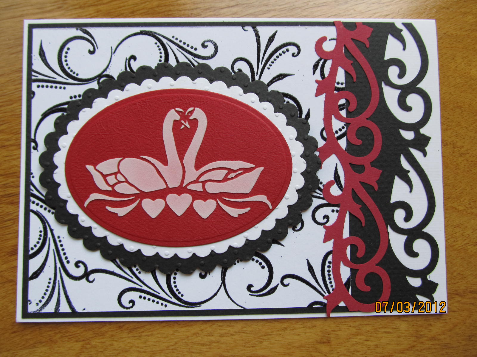
I had forgotten that I had this great swan stencil. I pulled it out and used silver metallic embossing paste on some of the black card stock pieces and white embossing paste on the others. I found that my metallic embossing paste had become somewhat 'gooey' over time. I don't know exactly how old it is, but I'm guessing about 2 years. I mixed it really well with the palette knife before applying to the surface and it was still a bit gooey and difficult to spread, but once it dried it looked fine.
I love using the EK Success punch that I had purchased in Sayner, WI at 'The Mark-It Place'. It is a 2 in 1 punch that can be used to create a border or used to create a stand alone flourish.
I used another of my EK Success punches on these 2 cards. Check out the cool decorative brads on the top card to the right. They are pearl shaped hearts. I found these in a discount scrapbook store near Pigeon Forge, TN.
I stayed with either the black and white, or red, black, and white theme. These cards will be great for weddings, anniversaries, valentine's day, or even a birthday for that special someone.
The set of stamps I used on these cards is from 'Sweetpea Stamps'. I had almost forgotten I had them! I'm so glad I remembered.
The butterfly is a cuttlebug set of embossing folders and a die. I created the butterfly with 3 layers. The bottom layer is a silver metallic card stock, the middle is a black vellum, and the top is a heart-patterned vellum. All 3 layers were run through the cuttlebug with an embossing plate to create texture.
I liked the butterfly so much I added it to 3 of these cards. The friend who asked me to make a wedding card requested that it be a larger card. Instead of making my usual 5 1/2 x 4 1/4" card I made these to be 7 x 5".
I only have about 2 or 3 verse stamps that would be appropriate for a wedding card and I didn't stamp the inside of any of these yet. I'll wait to see what I use them for and then stamp the sentiment inside.
I had forgotten that I had this great swan stencil. I pulled it out and used silver metallic embossing paste on some of the black card stock pieces and white embossing paste on the others. I found that my metallic embossing paste had become somewhat 'gooey' over time. I don't know exactly how old it is, but I'm guessing about 2 years. I mixed it really well with the palette knife before applying to the surface and it was still a bit gooey and difficult to spread, but once it dried it looked fine.
I love using the EK Success punch that I had purchased in Sayner, WI at 'The Mark-It Place'. It is a 2 in 1 punch that can be used to create a border or used to create a stand alone flourish.
I used another of my EK Success punches on these 2 cards. Check out the cool decorative brads on the top card to the right. They are pearl shaped hearts. I found these in a discount scrapbook store near Pigeon Forge, TN.
I stayed with either the black and white, or red, black, and white theme. These cards will be great for weddings, anniversaries, valentine's day, or even a birthday for that special someone.
The set of stamps I used on these cards is from 'Sweetpea Stamps'. I had almost forgotten I had them! I'm so glad I remembered.
The butterfly is a cuttlebug set of embossing folders and a die. I created the butterfly with 3 layers. The bottom layer is a silver metallic card stock, the middle is a black vellum, and the top is a heart-patterned vellum. All 3 layers were run through the cuttlebug with an embossing plate to create texture.
I liked the butterfly so much I added it to 3 of these cards. The friend who asked me to make a wedding card requested that it be a larger card. Instead of making my usual 5 1/2 x 4 1/4" card I made these to be 7 x 5".
I only have about 2 or 3 verse stamps that would be appropriate for a wedding card and I didn't stamp the inside of any of these yet. I'll wait to see what I use them for and then stamp the sentiment inside.
Subscribe to:
Posts (Atom)