Thursday, April 22, 2010

Artiscape - Layers upon Layers

On Friday afternoon (April 16) I took a class called Layers Upon Layers taught by Jacqueline Sullivan. I wanted to learn about various art mediums and this was the perfect class to take. All we needed to supply was an 11 x 14" stretched canvas, a 1" acrylic brush, and images copied on a laser copier. This class was FANTASTIC!!!
First we applied some aluminum foil, cheese cloth, and tissue paper using various mediums to our canvas. In doing so we learned what medium to use for the various weights of texture.
Before painting the background (canvas) we added texture using various methods. I used a sewing tracing wheel and ran it across the aluminum foil. I also used various tools to create circular impressions in the foil. Then I used molding paste and a brass stencil (fern) to create texture in several areas of the background.
The canvas had to dry before painting so at this point we moved on to the layers that would be placed on top of the canvas.
Jacqueline supplied various sized pieces of mat board that we were to use for our laser copied images. The images were to be of high contrast; mine were okay, but not the best. The images were attached to the mat board using gel medium. We applied the gel medium under the image and on top of the image.
Placement of the images onto the larger canvas was important. Jacqueline explained how to place them such that the person looking at the canvas would be drawn to look inward rather than away from the canvas.
Here are the 'layers', before painting, that I created for my canvas. The largest piece is a different image than the one I originally planned. Since I hadn't waited for the gel medium to dry before applying molding paste, when I picked up the stencil it stuck to the image and ripped part of it off the mat board. So I improvised and attached one of the other images I had brought with me.
I applied some molding paste to all of the pieces using either a stencil or punchinella.
This is my 11 x 14" canvas after all the painting was complete. I did have an issue with it... my colors seemed too distinct and disjointed. I took the piece to the instructor and she brought it back to my workspace applying a light wash of burnt umber over the entire piece. That simple step blended the entire piece. I intentionally had stepped out of my comfort zone with this mix of colors and I'm glad I did. The instructor stressed that we needed light, medium, and dark somewhere on the canvas. I'm still learning and to me it looks medium and dark only, but I know that I'm wrong.
I can't believe I made this!!!! Everyone in the class finished the project, and all were worthy of hanging on a wall. I think that it is amazing that everyone was able to finish this large project. There were so many lessons learned... it was well worth the money. I know I'll use what I learned in this class for other projects I've been wanting to tackle.
I'm not sure what I'll do with this piece. I may frame it, or attach some decorative edging around the entire piece and then display it in my craft room, which is also our spare bedroom.

Wednesday, April 21, 2010

Artiscape 2010 - Jacquard Toolbox

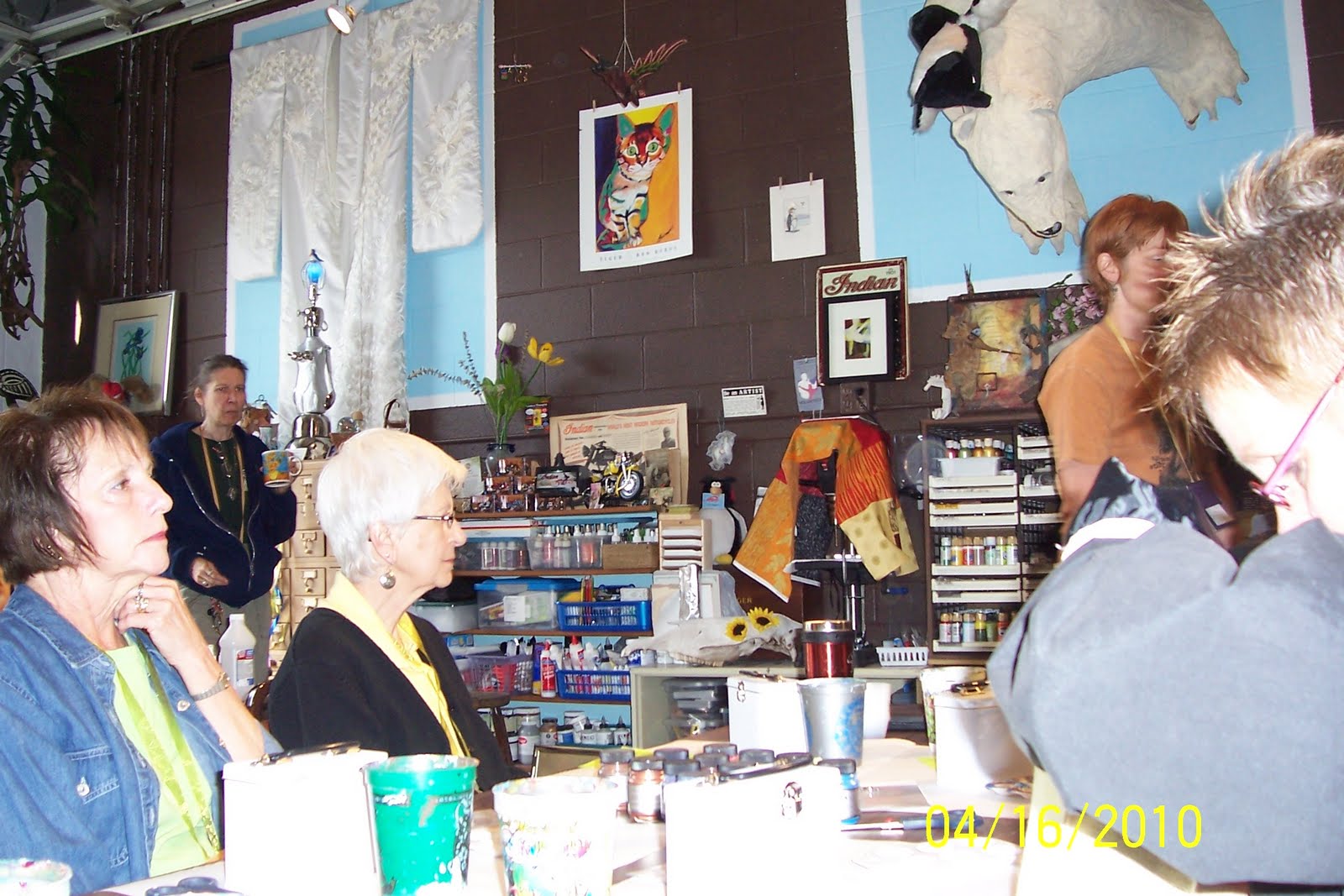
We arrived for our first class on Friday morning. The class was called Jacquard Toolbox and was taught by Amy Flowers. This was one of the few classes that was not being held at the Holiday Inn where we were staying. The class was held in Amy's studio... which looked more like a garage since we entered through this overhead door. Lucky for us it was a mild and sunny day and the door remained open throughout the class. It was a great environment to work in.


Everywhere you looked in Amy's studio/garage there was some form of art... or art supplies! This collage piece is a sample of one of the many classes that Amy teaches both here in Ohio, and in Mexico.


Look! There's Amy Flowers.... She is walking off to the right... behind Mary's head.
Barbara, Maggi, Mary, and I took this class. It was great fun!!! We loved Amy's personality.


Amy provided these tins so that we could keep our Jacquard samples in it. The tin was white to begin with and we painted them by mixing pearl ex and pearl ex varnish. They take a while to dry. We did stamp on them at the end of the class using stazon ink, but I found that the stazon removed some of the paint.


This is a very cool technique. Stamp an image with versa mark and use clear embossing powder. Heat partially and while still warm sprinkle, or apply (with your finger) pearl ex powder. Heat again, but not too long. When the powder is cool buff with a paper towel.
Another way to do this is to mix the clear embossing powder and pearl ex, sprinkle that onto the versa marked' card and heat.


We mixed pearl ex powders with pearl ex varnish to create a paint like texture. The mixture was applied to the acetate and the black glossy card stock was placed on top of the acetate. Give the two pieces a little twist and pull them apart. You don't want to leave them together very long, like I did, as some of the black glossy card will stick to the acetate! Oh well, I just got a little extra texture on my pieces!


On this piece I applied drops of Dynaflow. It comes in small bottles with a drip top. The colors are nice, but I don't see myself purchasing this product.


We applied acrylic paint to this piece of card stock and then interference paint on top of that. Before drying I used the end of the paint brush to draw through the interference.


This is a piece of deli wrap. I should have been taking better notes during the class, but things started to move pretty quickly. I don't recall what type of Jacquard product we applied to the paper. I do recall that after applying the color we folded the piece and rubbed so that the color would transfer to other areas of the sheet.


This is a piece of acetate that we applied pinata alcohol inks to. Amy told us that pinata inks are her favorite because she believes the color is more true and that they work better than the ranger brand on all applications except for plastic. Amy also indicated that she uses regular alcohol rather than buying the blending solutions that are sold specifically for pinata or ranger alcohol ink products.


I think that we applied pearl ex watercolors to this piece and I think I used every color on the palette for this piece. The pearl ex watercolors are similar to Twinkling H2O's. In Amy's opinion she prefers the Twinkling H2O's and I have to agree... I think they give more shine and better color.
It was a good class and we had a great time playing with the various Jacquard products.

Tuesday, April 20, 2010

Art Buddies at Artiscape 2010

It was the first time that Bev, Margaret, Mary, and I went to Artiscape in Ohio. Maggi and Barbara had attended this art retreat 2 other times. It has always been in April and always in Ohio. The retreat is organized by European Papers and this year it was held in Columbus, Ohio.
We didn't want to eat in the restaurant that was housed in the Holiday Inn where we were staying so we walked to Donato's, a pizza and sandwich place, that was about 7 blocks from the hotel. It was a little chilly that day, but it felt good to be out and about.
At this point Bev, Mary, and Maggi are in the lead.


It is our first day of class!!! Most classes were held somewhere in the hotel, but there were 2 off site locations. One of them was this art studio belonging to Amy Flowers. It is more like a garage that was converted to her studio. Everywhere you looked there was art... or art supplies. What a great place to have a class!!


Look closely to see Amy Flowers, our instructor. She is to the right, just beyond Mary's head, walking out of my view as I snap the picture. Four of us were together in this class: Barbara, Maggi, Mary, and I. We loved Amy's personality. It was a wonderful class... little did we know that classes would just keep getting better.


I had my camera with me the whole weekend, so why is it I kept forgetting to take pictures of us??? Here we are in the bar of the Holiday Inn. It is Sunday night, we are 'brain dead' from all of our classes and too tired to venture out for dinner.


So we sat in the bar, had drinks, and ordered appetizers. It was the best plan!!! Most people had left and we were able to talk and laugh, and drink!!!
It was a GREAT retreat, except for two things:
1) We missed Pea and Carol Sweeney and kept wishing they were with us!!
2) The Holiday Inn was VERY poorly managed... not enough staff to properly deal with the art retreat and poorly managed food service.

Bev says.... It is time we 'Wisconsinites' travel to California!

The retreat was over and it was our last day together.... Monday, April19. Barbara, Maggi, Mary, and I were flying out at 4:30. Both Bev and Margaret had rental cars and weren't flying out until Tuesday so we spent the day together. After checking out of the hotel we drove to Dick Blick Art supplies. We didn't buy much since we didn't know how close our luggage was to the 50 lb limit!!!!. This shopping area was fabulous!!! Not only was there a Dick Blick, but also a Hobby Lobby, Jo Ann's, Michael's, and more!!! We only went to Dick Blick and Hobby Lobby and then took a break for lunch at Panera's. After Panera's we stopped at a Big Lots and then it was off to the airport. It was sad to say goodbye to our California friends.

50th Wedding Anniversary book

Our friends Walt and Rita are celebrating their 50th Wedding Anniversary.. and we're invited to the party!!!
I had to make something for them. I had made one of these wine bottle shaped books for another couple when it was their 50th... just last year. I had cut the covers from mat board and painted with acrylic paints. I used my bind-it-all to punch and bind the book once it was completed.
On the cover I used a copy of the picture that was on the invitation for Walt and Rita's party. I layered the picture onto a piece of gold card stock that was die cut and embossed with a spellbinders die. I had several embellishments that worked perfectly for this project. A gold label that says "Celebrate", a couple of gold leaves, and metal numbers that I colored with a gold krylon pen. Below the picture I attached a label that I created with a P-touch label maker.
All of the pages for the book were cut from orchid card stock.
For the inside cover I used a spellbinders die cut to create the gold background and smaller white piece. I found a great saying that was appropriate for a 50th wedding anniversary. On the opposite page I attached a picture of Walt and Rita that I mounted onto orchid vellum. I had found another phrase that I typed onto white card stock, cut with decorative edge scissors, edged with a purple marker, and attached below the picture.


I didn't have a lot of pictures to fill the book so I used the internet to research what the cost of living was in 1960, the year Walt and Rita were married. I also created a list of U.S. Events; as well as, World Events. I typed that information onto purple and white colored card stock and attached to the pages.


Here's a look at two of the pages. Walt and Rita's daughter sent me a great sampling of pictures to use in the book. The picture on the right is my favorite of all the pictures. It is Walt and Rita with their daughter and grandchildren. All of them are sticking out their tongues after having eaten popsicles... so some tongues are pink while others are blue!!! I'm sure they'll be surprised and wonder how I was able to pull it off.
I used the various pictures to describe how Walt and Rita's 50 years resulted in a lasting marriage.


On the back of the wine book I die cut a gold scalloped oval as the background and a smaller scalloped oval in white card stock that had been typed prior to cutting.
I had the wine glass embellishment in my stash, but it was silver. So to continue with the gold theme, I colored the piece with a gold krylon pen.
The anniversary party is going to be this Saturday and we're so thrilled to be invited. Walt and Rita did not want any gifts, but I think they'll enjoy this little book!!! I know I would.

Saturday, March 20, 2010

'C' is for cuttlebug'd copper sheet/notebook

We're on to the letter 'C' in our alphabet swap over at CCSwaps. I've had some copper sheets for a few years so I got that out along with my Cuttlebug machine and a Quick Cuts embossing folder. I saw the idea for this simple notebook when I visited a great stamp store (The Mark-It Place) in Sayner, WI. The notebook is simply created using a front and back cover, inside pages, a wooden skewer, and an elastic cord. Two holes are punched at the top and the elastic cord is strung through so that it wraps around the skewer in the front and ties in the back. Once all the pages of this notebook are used up, the owner can simply cut and punch more pages and reassemble the notebook.
I cut 2 pieces of black card stock for the front and back covers. The black card stock had been sprayed with gold webbing spray. I also used a gold krylon pen around all edges of the black card stock. I ran the piece of copper sheet through the cuttlebug, applied double sided tape to the back and then attached to the front cover of the notebook. Then I applied a piece of red line tape around all 4 edges of the copper sheet so that I could adhere the copper micro beads that you see.

Tuesday, March 16, 2010

Leanna's 2009 Cross Country Medals

Our granddaughter, Leanna, completed her 2nd year running cross country for Muskego Middle School. She had a fabulous year... a medal in every race!!! While I had been putting together the shadow box with her 2008 awards I had the idea for the layout I used for her 2009 awards. I painted a cross country trail on mat board and then attached the medals along the trail. I created a label for each of the races that provides date, location, and place that Leanna took at that race. The small blue and yellow flags represent the flags that are used at the races to inform the runners whether to turn right or left. I found some cute sayings with regard to cross country so I used them along with some pictures I took at the races to embellish the shadow box. I found this shadow box at Michael's and love it!!! You can create 4 layers inside the box. The upper left and lower right corners were positioned at the 2nd layer and the display of medals is positioned at the 4th or furthest layer from glass. It allows you to create dimension to the display.

Wednesday, March 10, 2010

Pin Swap

CCSwaps is having a pin swap, so I thought I'd give it a try. At first I grabbed some memory glass and a frame, but then I saw a lot of stampboard in my supplies so I decided to use that instead.
I colored the oval piece of stampboard with 3 colors of distress ink, overlapping the colors. I then edged the stampboard piece with a purple Marvy Metallic Marker. The marker was bleeding a little onto the front of the stampboard, but I decided I liked the look so I intentionally added more marker to get more on the front of the pin. I stamped the 'vixen' stamp with india black ink and punched a small hole at the bottom of the oval stampboard so that I could twist some wire through and add beads. To finish the pin off I placed 6 dots of silver glitter glue along the right side of the pin. I hope the recipient likes the pin.