Tuesday, May 29, 2012

Play Day at Maggi's

We had a great play day at Maggi's.  Maggi, Pea, Mary, and I got together with the intention of trying various background techniques.  Each of us came with several ideas.  Other than a break for lunch, delicious corn and wild rice chowder and sandwiches, and another break for dessert, yummy pie, we worked from 9 AM until about 3:30.  We had a great time, completed lots of backgrounds, and came up with some ideas for our WI Art Retreat to be held sometime in October this year.
Even Miss Rosie got involved!!!  First she jumped into Pea's craft bag....

And then she jumped into Mary's bag...
She attempted to take a nap in the bag, but there was too much activity going on so eventually she wandered over to her little bed.

 Pea came prepared for all her techniques including this one.  She had stamped an image with embossing ink and then heat embossed with clear embossing powder on a piece of glossy card.  Each of us then colored our papers wtih various colors of alcohol ink.  This one happens to be mine.  But here are pictures of the others....

 Notice how you can still see the embossing.  It does not get covered by the inks.


 Once we were finished with this step, we moved on to the next step.   This technique produces 2 background pieces not just one.
We placed a piece of non glossy card stock on top of the piece we just inked and then ironed them.  Yes, iron.  I brought along a travel iron that I use for crafting and it worked great.  The heat of the iron melts the embossing powder transferring a colored image onto the non coated card stock.  Here are the results...
This is the sample that Pea made at home before our play day.


Here is another background technique from Pea.  She brought 2 pre-stamped pieces of glossy card stock for each of us.  She stamped them with brilliance ink.  Then each of us applied distress inks to the card stock.  We used the ink blending tool, but rather then pressing the ink blending tool onto the ink pad and then applying the ink to the card... we applied ink from the ink pads onto our craft sheets, spritzed them with water, and then used the ink blending tool to apply the ink.  This was a much smoother method of applying the ink.  This is a picture of all of our pieces.
And a 3rd technique from Pea...
On a regular piece of card stock Pea had stamped a background image (all the swirls) by applying white acrylic paint to her stamp using a sponge brush.  Pea brought one of these for each of us.  Next we all stamped the 'postal' type image using slate, black, or brown ink.  After the ink dried we rubbed the card with a paper towel removing some of the ink from the painted areas.  For the last step we applied distress ink with the ink applicator tool.  As in the previous technique we first applied ink directly from the ink pad to our craft sheet, spritzed with water, and then used the foam ink applicator.  Here are the rest of our pieces...


Now on to one of Maggi's techniques...
We all rummaged through a large pile of mulberry and handmade paper.  Maggi gave each of us a small plate for pva and a sponge brush along with a water brush.  We would tear our papers by first applying water with the water brush to aid the tearing process.  Then we would attach our strips and pieces of handmade papers to a piece of card stock or watercolor paper using the pva.  Here are the results of our efforts...
This is Maggi's ... I love all the colors she used!

This is Mary's... Very artistic!!

And here is Pea... She is trying to hide behind hers.


And then there is mine.  I did two half sheets instead of one whole sheet.

Here is another of Maggi's techniques...
She gave us each a roll of waterproof tape.  We are creating our own tissue tape.  We laid several strips of the tape onto our craft sheet.  There were several ways to approach this.
- You could stamp images onto the tape and be done
- You could stamp images onto the tape and then apply more color with other inks on top of the images
Or
- You could color the tape with various types of inks and then stamp images
Each of us did our own thing.  But we did discover some things.  Distress inks take a long time to dry.  I even heat set mine and they were still a bit wet to the touch.
If you wanted to use a dark ink for stamping the images it was best to use a stazon or india black ink, but even those did not dry quickly.
Most of us left our tape on our craft sheet to dry.  I even brought mine home on the sheet and will let it dry overnight.
These are my faux tissue tapes.


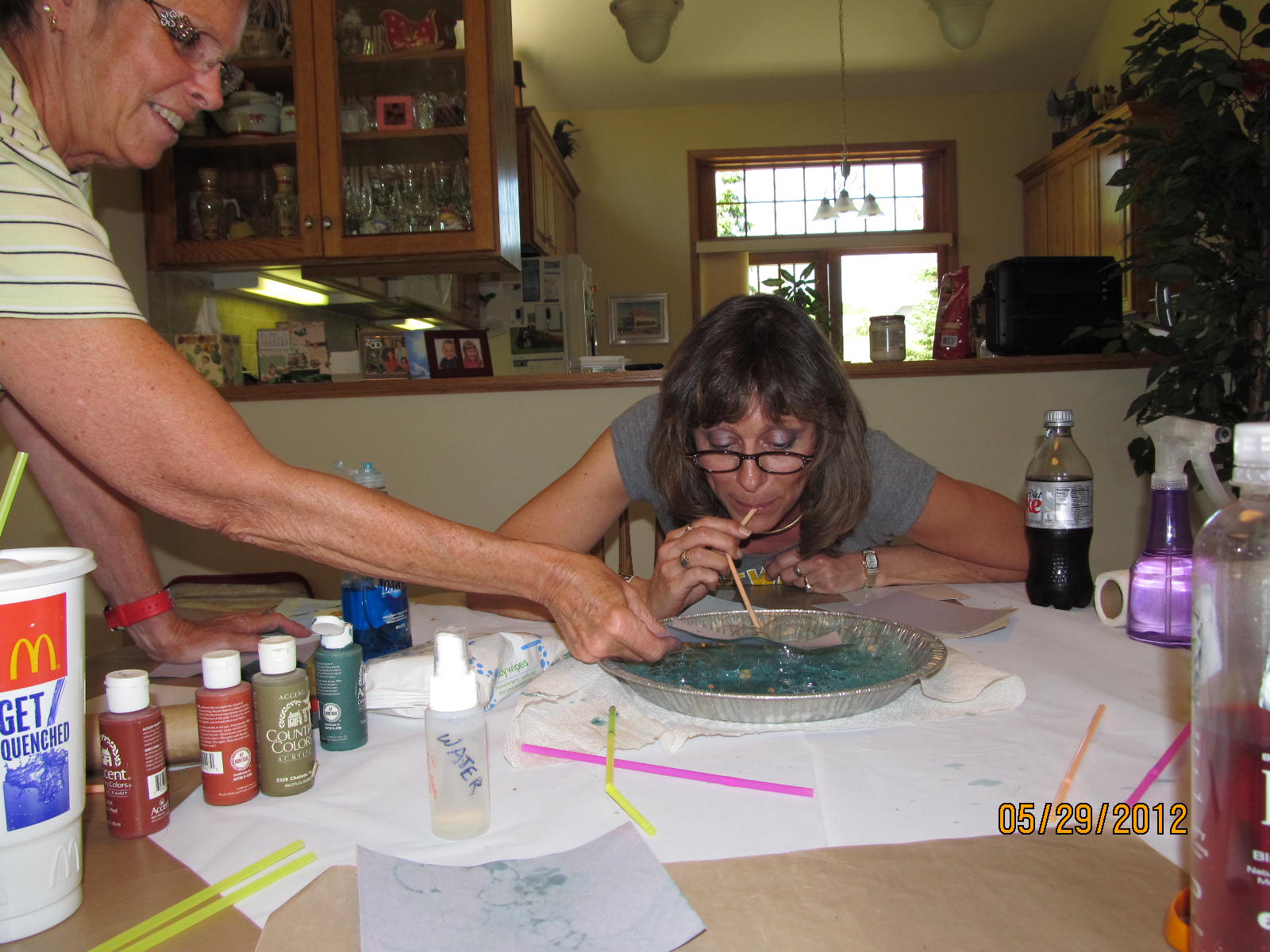
Now let's look at Mary's technique's.  What is Pea doing?  No, she isn't having a taste of some delicious concoction!  We were getting a lot of laughs doing this technique.. as you can imagine.
The technique calls for putting a little water, a little dish soap, and water soluble paint into a small bowl.  The aluminum pan we first started with was too large, but we struggled through with our first batch of green bubbles.
After stirring the mixture and adding more paint, more water, and more dish soap one person would blow through a straw into the mixture.  As bubbles formed another person would lay a piece of card stock onto the bubbles.  We found that the best way to get the color/bubbles to transfer to the card stock was to hold the card stock over the pan as the other person was blowing the bubbles.
After blowing bubbles in green paint we took a smaller dish and did the same with red paint.  We created some pieces with just the green, some with just the red, and others with a combination of the two.
We used some regular white card stock, some glossy card stock, and some colored card stock.
Everyone was happy with their results.
But if you try this ... make sure you only blow through that straw!!  You sure wouldn't want to suck any of that stuff in... YUCK!!!

Another of Mary's technique was shaving cream and reinkers.
Mary brought a large aluminum pan that she sprayed the shave cream into.  Then several of us took turns selecting 3 colors of reinkers to drop into the shave cream.
Mary used a plastic knife to move the ink through the shave cream.

 Then each of us would lay a sheet of our card stock into the cream and press lightly so that the sheet would be covered with the shave cream.  After removing the card stock from the cream we would use a plastic knife to scrape the cream off our card and then we would use a paper towel to take off the remaining shave cream.
It was amazing how different the card looked after totally removing the shave cream.

We each used several types of paper: kraft card stock, glossy card stock, white uncoated card stock, and curious text weight card (this has a sort of metallic sheen to it).
And we made several batches of shave cream using a different set of reinkers with each  batch.  These will make great backgrounds.

Here are some techniques I brought....
In this grouping of pieces are 2 techniques.  For both we used a combination of distress inks and brilliance inks.
We used uncoated white card stock and glossy card stock.
On some of the pieces we used crumbled pieces of wax paper tapped onto the ink pads and then pounced on the card.  You could use as many or as little color combinations that you wished.  And you could use only distress or also add brilliance to the mix.
On others of the pieces we used scrunched pieces of plastic wrap tapped onto the ink pads and then pounced on the card.
This technique is called Faux Marble.
There was a different look to the ink applied with the wax paper than that applied with plastic wrap.  I think the difference was that the ink applied with wax paper was more distinct, and that applied with plastic wrap had a softer look.

And then there was the Fossil Stone Technique using acetate.
I brought a sheet of heavy duty acetate for everyone to use.
The instructions were to sponge the reinkers onto the acetate using a synthetic sponge, and to not overlap the colors.
Next lay a piece of glossy card stock onto the acetate and brayer.
Then peel off the card stock.
We experimented...
We tried dropping the reinkers onto the acetate and then moving them around with the sponge, but sometimes that seemed to leave you with a large dark splotch of color.
We tried to drop the reinker onto the sponge and them dab onto the acetate.
I found that whichever way I applied the reinkers to the acetate that if I spritzed the acetate with water before laying down my glossy card I got better results.
I used the brayer, but found that using my fingers worked well.
We made sure we didn't use any permanent ink reinkers so that we could clean off the acetate and apply a different set of colors for another batch of card stock.
Look at the gorgeous colors in Maggi's batch!
It was such a fun day...
Thanks for hosting our play day Maggi... and thanks for the delicious lunch!!
Thanks for taking a day off work to join us Pea!!!


Monday, March 26, 2012

Work on Sudoku ATC's

I just received Mary's ATC's this morning and decided to work on them since I had an idea. I am the first to add to her background so in some ways that makes it easy come up with ideas. I used one of my Tim Holtz stamps... I call it tickets... inked it up with black india ink and stamped it along the right edge of each ATC.
There is a definite top and bottom to this image, if you want to have the words readable, so those who follow will need to beware of how they make their additions to the ATC. These ATC's will be on their way to Jan in a day or two. I want to make sure the ink is dry before packing them up in an envelope.

Seniors on the Go card

This past weekend our town held it's second annual fundraiser for 'Seniors on the Go'. This organization provides rides for those in our community that don't have access to transportation and that need a ride to places like the store, the Dr office, etc. The local Rotary and Lions clubs organize a fundraiser that includes a live band for dancing, raffles with prizes, and a silent auction. The event was very successful again this year, as it was last year.
As I did last year, I created and mailed out thank you cards to those businesses and individuals who donated prizes for the raffles and the silent auction. I ran a piece of brown card stock through the cuttlebug with the retro circles embossing folder and attached that to the kraft card. I scanned a section of map showing our local area and then ran off the necessary copies for the cards. I sponged the edges with vintage photo distress ink before attaching to the right side of the card. I used a spellbinders label die to cut and emboss the 'Seniors on the Go' I had typed on some off white paper and then sponged the inside edges with vintage photo distress ink. I added 2 small dots of walnut stain distress stickles to the label before attaching it to the card with dimensional foam pieces. I stamped the old car using stazon saddle brown ink onto bright white shrinky dinks, cut it out, and then shrank with a heat gun. I applied the car to the map with a glue dot.
The thank you cards I made last year were similar, but since playing with shrink plastic earlier this year I decided to use it for the car.

Sudoku ATC's - Round 2

Round 2 of our sudoku ATC's is beginning and here are my backgrounds. This time we needed to make 8 because Mary has decided to join us.. hooray!!!
When I finished my backgrounds I looked back at the ones I had done for round 1. I found that my color scheme was very similar. But, I did use a different technique for these and I like them so much so I am going to use them.
I found the technique on Carol Sweeney's blog. You start with 2 sheets of glossy paper and 3 different colors of dye reinkers. After applying drops of the reinkers to one of the glossy sheets, and then spraying with some water, you place the second glossy sheet on top and 'smoosh'. A very technical term. When you pull the 2 sheets apart you can 'smoosh' them back together if you have any uninked areas. And if you don't like the colors you could add more reinkers and water and 'smoosh' again!! Very simple and very beautiful.

Sunday, March 18, 2012

March shoebox

Shoebox night if fast approaching.. time to create. I wanted to use some of the new 'toys' I recently purchased at the Mark-It Place in Sayner. I used an embossing folder made by Darice. I ran a piece of white card stock through the cuttlebug with the embossing folder then layered that onto black glossy card stock, and then onto the green card. I used a Martha Stewart punch (birds on a wire) with red card stock to create the birds and then attached them with glossy accents. I used some green card stock to punch the grass with a fiskars punch and attached that to the bottom edge with glossy accents. And then, Bonnie will love this, I used my bow maker to tie the double bow using green ribbon and attached to the trunk of the tree with a glue dot.

For this card I used the embossing folder with Core'Dinations paper. This piece is from the Whitewash collection which is an off white on one side and various colors on the opposite side. After running the piece through my cuttlebug with the embossing folder I sanded the paper so that the blue/green color was exposed. Before attaching the embossed piece to the card I attached the small label to the front so that the thread I had strung through the holes on each side could be attached to the back. The 'think happy thoughts' is a small stamp I have that fits perfectly in the small nestabilities label. Again I used some of the red birds I had punched for the first card I did and a piece of green card stock that I punched to look like grass.

Sudoku ATC's - Round 2

Our WI Art Camp Group had so much fun with our first round of Sudoku ATC's that we've decided to do it again. This time we'll have 8 people instead of 7 since Mary has decided to join us... YEA!!!
Here are my backgrounds. I didn't realize until doing this posting to the blog that my backgrounds for this second round look a bit similar to the backgrounds I made for the first!!! But, these were created differently. I used 3 colors of reinkers: beach ball yellow/posh rainbow inks, sailboat blue/posh rainbow inks, and soft lilac/memories. I placed droplets of each of these inks (more of the yellow than the others) across a sheet of glossy card stock, I then sprayed with water, and then layed another sheet of glossy card stock on top of the first. I smoshed and twisted the 2 sheets together and then pulled them apart. If there were any white spots I smoshed the 2 sheets together again. I really like this look, so even though my color scheme may be similar to our first round I'm sticking with these backgrounds. Our swap starts the first week in April so I will wait a while before mailing these to Maggi... or I can take them over to her house on Monday since we have our shoebox night then.

Thursday, March 15, 2012

Play Day - Feb 2012

How exciting!!!! Pea, Maggi, and I planned a play day in February. We hadn't gotten together to play in years. We were all looking forward to it. We decided to have a marathon card making day. The plan was for each of us to design 3 different cards and then bring enough supplies for all of us to create 5 of each design. Were we crazy!!! That would mean that each of us would be creating 45 cards.... in one day!!! Can we do it?? And remember, we needed to take a break for lunch too!
Silly me... Pea took pictures during the day as we worked and from where I was sitting my camera was within my reach! How come I never thought of picking it up and snapping a few pictures? Well, here we go....

My 1st card design is definitely a birthday card. The blue piece of card stock was embossed with a cuttlebug embossing folder. We had the choice of using the 'numbers' or the 'happy birthday' embossing folder. The five candles image was stamped onto a piece of blue card stock and then cut with a spellbinders label die. We sponged the edges of that piece with faded jeans and colored the flames with a gel pen before attaching to a brown piece of card stock that had been die cut from another spellbinders label die. We punched holes on both sides of the piece and then threaded ribbon through. There were various choices of ribbon available. The ribbon was secured behind the blue layer before attaching that layer to the brown card. We stamped 'wish big' onto a piece of blue card stock and then cut with a spellbinders inverted scallop circle die. We sponged the faded jeans ink around the circle and colored the star with gel pen before attaching with dimensional foam squares.


My 2nd card design has a few layers. A tan card stock was layered onto the green card. I cut some decorative scrapbook paper and then punched each corner with a decorative punch. Brass brads were inserted into the corners of the decorative card stock after the edges were sponged with vintage photo distress ink and before attaching to the tan layer. We stamped the lighthouse and then cut using a spellbinders oval die. The edges were sponged with vintage photo ink before attaching to a green oval that was cut with a spellbinders deckle edge oval die.


My 3rd card design. I really like the clock theme; it seems to be good for so many card giving occasions. The rust layer was embossed with a cuttlebug embossing folder and was swiped with an ink pad... although you can hardly tell. I used a spellbinders decorative tag die with the tan card stock and then stamped the words on a piece of rust which was then cut to fit in the center of the tag. The flying clocks were stamped with black ink on tan card stock and cut out. We used a clear stardust glitter pen on the wings of the clock although I don't think the shimmer is showing up in this photo. Then they were attached to the card front using dimensional foam squares.


Working hard to get as many cards finished as humanly possible!


Here is Maggi's 1st card style. Instead of creating 3 card designs and bringing supplies to make 5 of each, Maggi created 5 card designs and enough supplies to make 3 of each. No matter, I was happy to have all the various styles of cards.
The background of this card was embossed with a cuttlebug folder and then inked. The 'celebrate' was cut from a tag/label die and attached to the card with dimensional foam squares. Before attaching the tag the the card we folder a flower embellishment and tucked it under the corner.


Another great card from Maggi. This is her 2nd card style. We received 3 different colors of card stock pieces for the strip attached to the top of the card. And, we had a choice of several cuttlebug embossing borders to use on that strip. The solid piece of card stock behind the 'birthday' label is color coordinated with the strip across the top of the card.


Here is Maggi's third card. We each had the same pieces in our card kits except for the decorative strip that we attached to the right side of the card. There were several colors and patterns available for us to choose from.


This is definitely Maggi's style. In her 4th card we stamped the flower and greeting on white card stock and then layered those pieces onto either a peachy or blue piece of card stock. We cut out a third piece of colored card stock and then attached all three pieces to the white card. Maggi had purchased some bird embellishments for us to use on the lower right of the card. We also stamped a bird image, cut it out, and attached to the inside of the card.


Maggi's 5th card will make a great birthday card for kids. The brightly colored decorative card stock and ribbon along with the cupcake sticker make it perfect for kids. These are the cards I made following Maggi's sample.


And the card making marathon continues!!


And now for Pea's contribution.
For each of her 3 cards she handed each of us a large envelope with a multitude of card stock, decorative papers, and in this 1st envelope, some ribbon and white shrink plastic pieces.
Each envelope contained more materials than we needed to make the 5 cards.


These are the cards Pea created for us to use as guidelines as we created our own variations. I loved Pea's black and white theme, but I started combining red with the white and black and then wandered into yellow, black, and white.


Here are my creations of the shrink plastic cards. I love these!!! And I love the look of white shrink plastic much more than the clear shrink plastic that I had been using in the past. I have more shrink plastic pieces and papers to use and plan to do so in the future. Most images that were stamped on the papers were done using Pea's stamps.


Here are the contents of the 2nd envelope that Pea gave me. My mind went blank!!


Here are examples of Pea's cards. The idea was to tear paper, punch out paper, or cut paper to create abstract designs on the white cards. I love the look of these cards and this is so different from 'my style', but I really want to make these. I haven't yet sat down to make any!!! But, I will.


This is what I found in my 3rd envelope from Pea. There is such a great assortment of card stock and decorative papers here... and a ton more than I will need to make 5 cards. Where do I start??


These are the cards that Pea created that we used as guidelines to create our own batch of cards. I didn't get any cards done on that day, but did work on some in the weeks after. Following are pics of my creations following this style. I still have materials left to make more cards in the future.


These whimsical cards were created based on some of Pea's samples and using materials she supplied. Even the stamped images were created with Pea's stamps. Some of these design ideas were quite different from my usual so it was great to expand my horizons.


I created these 3 cards following some of the samples Pea had provided. It was fun to combine the various decorative papers having the same color scheme. I also used one of Pea's stamps for the central image.


Here are 3 more cards I created using the materials supplied by Pea. The stamped image is also from one of Pea's stamps; I really like that stamp and maybe someday will have to get one for myself. These are great cards for men.