Friday, April 23, 2010

Artiscape 2010 - A Background Menagerie

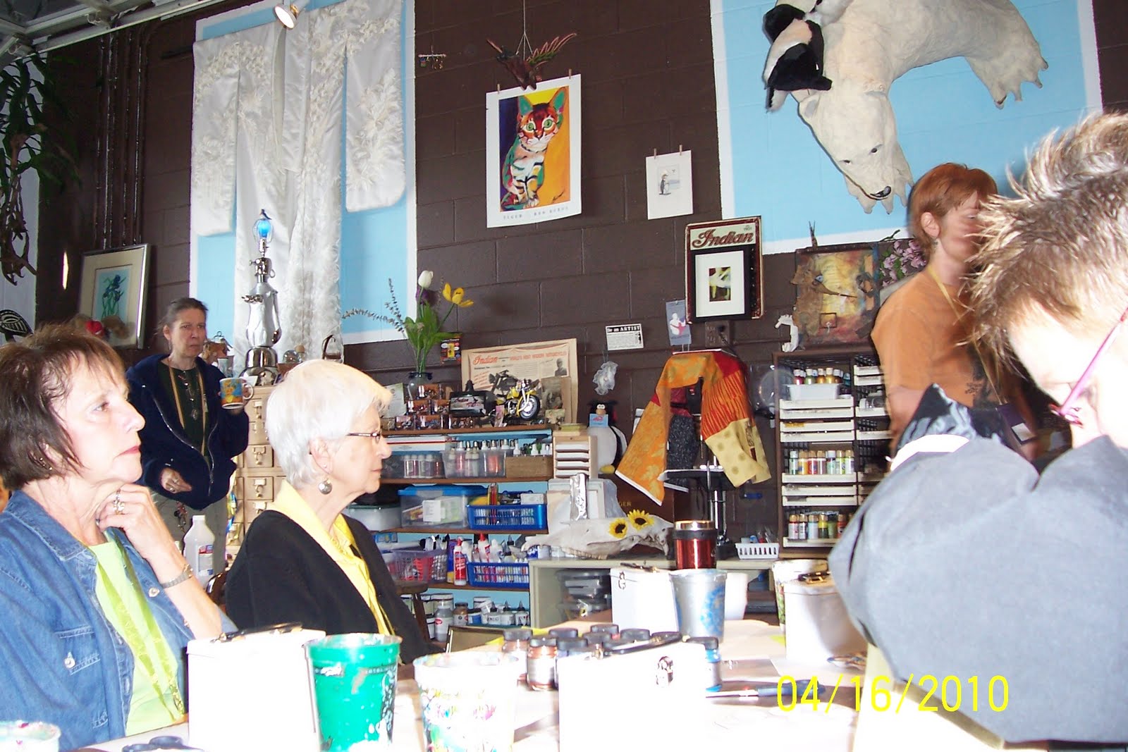
Sunday (April 17) was my last class at Artiscape. It was called A Background Menagerie and was taught by Kari McKnight-Holbrook. She is a sweet person and a great instructor. She had set up work stations for the various backgrounds (27 plus). She provided written instructions on an index card and samples of each background at the work stations. I did not finish them all; I didn't even get all of them written down, but here are most of those that I did complete.
Plastic Wrap (shown above)
- Paint entire page with one color of acrylic paint and let dry
- Use a second color of acrylic paint, either lighter or darker, and cover the entire page again
- Quickly cover the page with a piece of plastic wrap and crinkle it up throughout the page
- Let dry and then remove the plastic wrap
I really like the outcome and would do this technique again.
Inky Marbles
- Secure the page to the bottom of a container using small pieces of tape in the 4 corners. In class we used a tupperware container with a lid. Depending on how wild you get when you roll the marbles you could use an uncovered container.
- Place several, we used about 8 to 10, marbles in the container. Place a couple of drops of 1 or 2 colors of alcohol ink onto the marbles.
- Close the lid of the container and shake the container so the marbles roll across the paper.
- Open the container and place 1 to 2 drops of alcohol (or blending solution) onto the marbles.
- Close the lid and shake the container again.

Inky Marbles
This inky marbles was created the same as described above except that before I performed the inky marbles technique I painted the page with acrylic paint.
This was one of my favorite techniques also and I can see myself doing this again.
If you are doing multiple pages you want to make sure that the inside of the container is dry before you start on your next page. You can wipe it out with a paper towel.


Spinner
For this technique we used a spinner. It can be found in the children's art section. We found it at a Hobby Lobby under the manufacturer's name of Creative Kids and the cost was $15.
- Affix page onto the spin plate using small pieces of masking tape in the corners. Make sure it sticks or the page will fly off.
- Mix paint and water to a consistency that is a watery drip so that you can use an eye dropper.
- Turn on spinner and using the eye dropper, drip the paint onto the paper.
You can drop the paint anywhere on the paper; it does not have to be placed in the center of the page. Use multiple colors and work from light to dark. Everyone enjoyed this technique... I may have to buy a spinner!!!
Alcohol Ink Spatter
- Place a couple of drops of alcohol ink onto glossy paper. It is best to work with one color at a time.
- Immediately spray the ink using a can of compressed air. The product we used was called 'dust off'.
- Add additional colors as desired.

This is a fun technique. It was my first time using a can of air and I learned that you should not shake it and only spray holding the can upright or the can will freeze up and not work until it warms up again.
Coffee Filter
- Using an ordinary coffee filter, fold it up into whatever shape or size you wish
- Apply paint to various areas of the coffee filter. In this example I dipped the coffee filter into a cup of water that was used to clean brushes and then I applied a darker green in a stripped pattern.
- Let the coffee filter dry and then adhere to card using gel medium. The excess filter that hangs over the edge of the page can be cut off or folded over to cover the back of the page.
Flu Tape
- Place a piece of flu tape (also called metal tape) shiny side down on a texture plate
- Rub with a popsicle stick or stylus
- Peel off back of tape and position onto card. Once placed down this tape is permanent.

I found this tape at a local hardware store near the plumbing supplies; it comes in a fairly large roll. I would think you could run this through embossing machines, like a cuttlebug. Just remember to leave the backing on the tape until you are ready to adhere to the page. You can now paint the tape or use alcohol inks on it.
Windows
- Hold 2 pages together making sure the pages are lined up and punch through both. I used a square punch.
- Insert magazine photo, graphic, colored paper, or transparency between pages using pieces of scotch tape to hold in place. We used printed transparencies.
- Adhere pages together using tape, gel medium, or whatever method you wish

Foil
- Start with a page that contains texture/raised areas. We created raised areas by applying gesso more heavily in some areas and manipulating with our paint brush handle.
- Apply gel medium over entire page and let dry
- Place foil shiny side up on part or all of page
- Press onto foil with a heating iron
- Pull off foil
I like this technique, but I think I need more practice.
Magazine Pages and Rubbing Compound
- Select a colorful magazine page, adhere to card with gel medium, let dry
- Take labels (I used round ones) and rub them on your clothing so that they are less sticky
- Place labels on colorful areas of page
- Take a small piece (cottonball size) of Neverdull and rub on and around the labels or anywhere else on the page
- Pull off labels


Portfolio Oil Pastels
- Color card heavily with Portfolio Oil Pastels
- Using a brush and moving from light to dark, apply future floor wax

I think this works best if you apply the floor wax very sparingly on the paper otherwise it puddles up. In class it also became a problem since everyone was using the same brush causing the colors to muddy.
Bleach Pens
- Use dark card stock
- You can rough up the edges of the card stock with an emery board if you wish
- Write/draw onto the card stock with the bleach pen
- Set aside to dry

I'm not sure I care for this one. After this dried some of the white that you see was crumbling off the paper. I don't know if I applied to much of the bleach from the pen or if this is how it should be.
Scotch Tape Doubles
- Choose a magazine page with interest on both sides of the page
- Apply gel medium to magazine page and smooth it onto the card making sure to have focal image facing up
- Place strips of scotch tape across parts of image you want to preserve
- Let gel medium dry and then rub off pulp using wet fingers; spritz the page with water if needed

I think that clear packing tape would be better as it is wider. I like how the print from the other side of this magazine page stays on the card after rubbing off the pulp.
Masking Tape
- Apply strips of masking tape over the page
- Gesso over the tape
- When dry, apply glaze over the page
- Rub and buff over glazed page

I think I should have used more masking tape to create more texture.... and I think I forgot to rub and buff over the page once it dried. The class was getting a little hectic at that point.

Woven Text
- Take a page with text and cut or tear into strips
- Apply gel medium over the entire page
- Lay the strips of text down making sure to weave them
- Touch up with gel medium where necessary to adhere the text pieces to the page
* Once dry I painted over the entire page with a tinted glaze
I think this would look better if I had ripped the text paper instead of cutting it, and I think that a darker paint would also be better.

Artiscape 2010 - Mediums Make Your Art Go Round

On Saturday afternoon (April 17) I took a class called Mediums Make Your Art Go Round taught by Cody Goodin. Cody has a studio of his own and works at an artist supply store in Cincinnati near the University. The only supplies I needed for this class were a palette knife and a couple of small brushes; Cody supplied all the rest. He started us out with 4 faces that he created with molds and mounted onto a gesso'd ATC sized piece of mat board. All the faces were different. On the right are 2 of my faces shown after I already had stared applying some of the mediums we were playing with.
This is what my 4 faces looked like after I applied the various 'textures'. I can identify some of the mediums I used, but I think I've already forgotten what some of them are. We also used tissue paper and a fibrous paper and adhered it with gel medium to add interest. In the upper left face there are some gold mica flakes. The lower left face has pumice gel (the 'concrete-looking' stuff) and garnet gel (the pink areas). The black on the face to the lower right is lava gel. Many of the mediums we used were Golden products, but some, like the lava gel aren't made by Golden.
Here's a look at my 4 faces after I painted them. This was a great class to experiment... so that is exactly what I did when I painted them. I really didn't think much about the colors I was using or what I would do with these faces once I finished. The instructor supplied all the paint so I just tried using different color combinations on each of the 4 faces.
Once again I enjoyed this class as it gave me the opportunity to use various mediums and see if I liked them before I spend any money on them. But, I must confess.... I already had some of these mediums in my possession and haven't used them yet. Now I know what they look like and will be more likely to use them on some project. I just have to remember that I have them!!! That is the problem with having so many art supplies... you sometimes forget that you have something.

Thursday, April 22, 2010

Artiscape 2010 - Artistic Soldering for Beginners

On Saturday morning (April 17) I took Artistic Soldering for Beginners taught by Paula Hardesty. The only things we needed for this class were round nose pliers, wire cutter, and flat pliers. We could bring our own 1 x 3" images if we wished. All other items were supplied... even a soldering iron which we kept.
I used the images Paula supplied. We cut the images to fit within the glass microscope slide 'sandwich', cutting an image for the front as well as the back. We cleaned the glass with alcohol; it is the only thing that will erase any finger prints. Once we put the 'sandwich' together we wrapped it with copper foil tape. Paula suggested, and provided, a heavy duty tape that is likely found in stores that supply stained glass tools and supplies. Paula would demonstrate each step of the process we were following and then walk around to answer any questions and assure we were understanding her instructions. I found soldering to be very easy and lots of fun!!! After the slides were soldered around the edges and on both sides we learned how to shape the wire used as an embellishment. Then Paula taught us how to create texture..... the droplets of solder seen on the front of my slides.

After we finished with our pieces we cleaned the glass with windex and then polished both the front and backs using a cream that Paula had supplied. There were some black spots on the solder that disappeared once we polished the slides.
This is the back of the slides. I didn't add any wire wrapping or textured solder. At this point I don't know what I will do with these 2 pieces. BUT, what I do know is that I will do more soldering on my own.
Since the solder we used in class contains lead, the instructor told us not to wear these so that they are resting on bare skin. I would like to learn how to do silver soldering next, I think!!!

Artiscape - Layers upon Layers

On Friday afternoon (April 16) I took a class called Layers Upon Layers taught by Jacqueline Sullivan. I wanted to learn about various art mediums and this was the perfect class to take. All we needed to supply was an 11 x 14" stretched canvas, a 1" acrylic brush, and images copied on a laser copier. This class was FANTASTIC!!!
First we applied some aluminum foil, cheese cloth, and tissue paper using various mediums to our canvas. In doing so we learned what medium to use for the various weights of texture.
Before painting the background (canvas) we added texture using various methods. I used a sewing tracing wheel and ran it across the aluminum foil. I also used various tools to create circular impressions in the foil. Then I used molding paste and a brass stencil (fern) to create texture in several areas of the background.
The canvas had to dry before painting so at this point we moved on to the layers that would be placed on top of the canvas.
Jacqueline supplied various sized pieces of mat board that we were to use for our laser copied images. The images were to be of high contrast; mine were okay, but not the best. The images were attached to the mat board using gel medium. We applied the gel medium under the image and on top of the image.
Placement of the images onto the larger canvas was important. Jacqueline explained how to place them such that the person looking at the canvas would be drawn to look inward rather than away from the canvas.
Here are the 'layers', before painting, that I created for my canvas. The largest piece is a different image than the one I originally planned. Since I hadn't waited for the gel medium to dry before applying molding paste, when I picked up the stencil it stuck to the image and ripped part of it off the mat board. So I improvised and attached one of the other images I had brought with me.
I applied some molding paste to all of the pieces using either a stencil or punchinella.
This is my 11 x 14" canvas after all the painting was complete. I did have an issue with it... my colors seemed too distinct and disjointed. I took the piece to the instructor and she brought it back to my workspace applying a light wash of burnt umber over the entire piece. That simple step blended the entire piece. I intentionally had stepped out of my comfort zone with this mix of colors and I'm glad I did. The instructor stressed that we needed light, medium, and dark somewhere on the canvas. I'm still learning and to me it looks medium and dark only, but I know that I'm wrong.
I can't believe I made this!!!! Everyone in the class finished the project, and all were worthy of hanging on a wall. I think that it is amazing that everyone was able to finish this large project. There were so many lessons learned... it was well worth the money. I know I'll use what I learned in this class for other projects I've been wanting to tackle.
I'm not sure what I'll do with this piece. I may frame it, or attach some decorative edging around the entire piece and then display it in my craft room, which is also our spare bedroom.

Wednesday, April 21, 2010

Artiscape 2010 - Jacquard Toolbox

We arrived for our first class on Friday morning. The class was called Jacquard Toolbox and was taught by Amy Flowers. This was one of the few classes that was not being held at the Holiday Inn where we were staying. The class was held in Amy's studio... which looked more like a garage since we entered through this overhead door. Lucky for us it was a mild and sunny day and the door remained open throughout the class. It was a great environment to work in.


Everywhere you looked in Amy's studio/garage there was some form of art... or art supplies! This collage piece is a sample of one of the many classes that Amy teaches both here in Ohio, and in Mexico.


Look! There's Amy Flowers.... She is walking off to the right... behind Mary's head.
Barbara, Maggi, Mary, and I took this class. It was great fun!!! We loved Amy's personality.


Amy provided these tins so that we could keep our Jacquard samples in it. The tin was white to begin with and we painted them by mixing pearl ex and pearl ex varnish. They take a while to dry. We did stamp on them at the end of the class using stazon ink, but I found that the stazon removed some of the paint.


This is a very cool technique. Stamp an image with versa mark and use clear embossing powder. Heat partially and while still warm sprinkle, or apply (with your finger) pearl ex powder. Heat again, but not too long. When the powder is cool buff with a paper towel.
Another way to do this is to mix the clear embossing powder and pearl ex, sprinkle that onto the versa marked' card and heat.


We mixed pearl ex powders with pearl ex varnish to create a paint like texture. The mixture was applied to the acetate and the black glossy card stock was placed on top of the acetate. Give the two pieces a little twist and pull them apart. You don't want to leave them together very long, like I did, as some of the black glossy card will stick to the acetate! Oh well, I just got a little extra texture on my pieces!


On this piece I applied drops of Dynaflow. It comes in small bottles with a drip top. The colors are nice, but I don't see myself purchasing this product.


We applied acrylic paint to this piece of card stock and then interference paint on top of that. Before drying I used the end of the paint brush to draw through the interference.


This is a piece of deli wrap. I should have been taking better notes during the class, but things started to move pretty quickly. I don't recall what type of Jacquard product we applied to the paper. I do recall that after applying the color we folded the piece and rubbed so that the color would transfer to other areas of the sheet.


This is a piece of acetate that we applied pinata alcohol inks to. Amy told us that pinata inks are her favorite because she believes the color is more true and that they work better than the ranger brand on all applications except for plastic. Amy also indicated that she uses regular alcohol rather than buying the blending solutions that are sold specifically for pinata or ranger alcohol ink products.


I think that we applied pearl ex watercolors to this piece and I think I used every color on the palette for this piece. The pearl ex watercolors are similar to Twinkling H2O's. In Amy's opinion she prefers the Twinkling H2O's and I have to agree... I think they give more shine and better color.
It was a good class and we had a great time playing with the various Jacquard products.

Tuesday, April 20, 2010

Art Buddies at Artiscape 2010

It was the first time that Bev, Margaret, Mary, and I went to Artiscape in Ohio. Maggi and Barbara had attended this art retreat 2 other times. It has always been in April and always in Ohio. The retreat is organized by European Papers and this year it was held in Columbus, Ohio.
We didn't want to eat in the restaurant that was housed in the Holiday Inn where we were staying so we walked to Donato's, a pizza and sandwich place, that was about 7 blocks from the hotel. It was a little chilly that day, but it felt good to be out and about.
At this point Bev, Mary, and Maggi are in the lead.


It is our first day of class!!! Most classes were held somewhere in the hotel, but there were 2 off site locations. One of them was this art studio belonging to Amy Flowers. It is more like a garage that was converted to her studio. Everywhere you looked there was art... or art supplies. What a great place to have a class!!


Look closely to see Amy Flowers, our instructor. She is to the right, just beyond Mary's head, walking out of my view as I snap the picture. Four of us were together in this class: Barbara, Maggi, Mary, and I. We loved Amy's personality. It was a wonderful class... little did we know that classes would just keep getting better.


I had my camera with me the whole weekend, so why is it I kept forgetting to take pictures of us??? Here we are in the bar of the Holiday Inn. It is Sunday night, we are 'brain dead' from all of our classes and too tired to venture out for dinner.


So we sat in the bar, had drinks, and ordered appetizers. It was the best plan!!! Most people had left and we were able to talk and laugh, and drink!!!
It was a GREAT retreat, except for two things:
1) We missed Pea and Carol Sweeney and kept wishing they were with us!!
2) The Holiday Inn was VERY poorly managed... not enough staff to properly deal with the art retreat and poorly managed food service.

Bev says.... It is time we 'Wisconsinites' travel to California!

The retreat was over and it was our last day together.... Monday, April19. Barbara, Maggi, Mary, and I were flying out at 4:30. Both Bev and Margaret had rental cars and weren't flying out until Tuesday so we spent the day together. After checking out of the hotel we drove to Dick Blick Art supplies. We didn't buy much since we didn't know how close our luggage was to the 50 lb limit!!!!. This shopping area was fabulous!!! Not only was there a Dick Blick, but also a Hobby Lobby, Jo Ann's, Michael's, and more!!! We only went to Dick Blick and Hobby Lobby and then took a break for lunch at Panera's. After Panera's we stopped at a Big Lots and then it was off to the airport. It was sad to say goodbye to our California friends.

50th Wedding Anniversary book

Our friends Walt and Rita are celebrating their 50th Wedding Anniversary.. and we're invited to the party!!!
I had to make something for them. I had made one of these wine bottle shaped books for another couple when it was their 50th... just last year. I had cut the covers from mat board and painted with acrylic paints. I used my bind-it-all to punch and bind the book once it was completed.
On the cover I used a copy of the picture that was on the invitation for Walt and Rita's party. I layered the picture onto a piece of gold card stock that was die cut and embossed with a spellbinders die. I had several embellishments that worked perfectly for this project. A gold label that says "Celebrate", a couple of gold leaves, and metal numbers that I colored with a gold krylon pen. Below the picture I attached a label that I created with a P-touch label maker.
All of the pages for the book were cut from orchid card stock.
For the inside cover I used a spellbinders die cut to create the gold background and smaller white piece. I found a great saying that was appropriate for a 50th wedding anniversary. On the opposite page I attached a picture of Walt and Rita that I mounted onto orchid vellum. I had found another phrase that I typed onto white card stock, cut with decorative edge scissors, edged with a purple marker, and attached below the picture.


I didn't have a lot of pictures to fill the book so I used the internet to research what the cost of living was in 1960, the year Walt and Rita were married. I also created a list of U.S. Events; as well as, World Events. I typed that information onto purple and white colored card stock and attached to the pages.


Here's a look at two of the pages. Walt and Rita's daughter sent me a great sampling of pictures to use in the book. The picture on the right is my favorite of all the pictures. It is Walt and Rita with their daughter and grandchildren. All of them are sticking out their tongues after having eaten popsicles... so some tongues are pink while others are blue!!! I'm sure they'll be surprised and wonder how I was able to pull it off.
I used the various pictures to describe how Walt and Rita's 50 years resulted in a lasting marriage.


On the back of the wine book I die cut a gold scalloped oval as the background and a smaller scalloped oval in white card stock that had been typed prior to cutting.
I had the wine glass embellishment in my stash, but it was silver. So to continue with the gold theme, I colored the piece with a gold krylon pen.
The anniversary party is going to be this Saturday and we're so thrilled to be invited. Walt and Rita did not want any gifts, but I think they'll enjoy this little book!!! I know I would.