I'm finished with my 2013 calendars!!! Hurray!!!
It was fun. I have several stamps that are motivational type phrases and I wanted to use them on this year's calendars.
I still had a bunch of these cute little drink umbrellas and they seemed the perfect addition for this phrase.
I love this saying... what am I saying... I love all the phrases I used on these calendars!!!
I have a lot of decorative papers, and this sheet from a BoBunny pack was a good choice with the Tim Holtz man and umbrella stamp. Is there a theme going on here with my calendars??? I just realized I have another umbrella in this set of calendars!!
Here is that same phrase and the umbrella man, but on a different sheet from the BoBunny pack. I used one of my newest purchases on this set of calendars. It is up there in the top left corner and it is called mica fragments. The color is tea stained; it comes in several colors, and it is from Stampendous. I attached the flakes with a little dab of glue. At the rate I'm using these flakes they'll last me forever... with half the jar leftover.
I bought this stamp some time ago... like years. I don't know if I ever used it until today. I ran the background piece through the Cuttlebug using the Roman Bath embossing folder. The paper is 'So...Jeans Blue' and I purchased it from The Paper Cut. After running the piece through the Cuttlebug I used a piece of sandpaper so that some of the white core came through.
This calendar is using the same stamp and paper as the one shown above. The difference being that I used the 'Retro Squares' embossing folder.
These colorful papers were in my large folder containing scraps. But the scraps were large enough to accommodate the sizes I needed for the calendar. I added a little ric rack where the 2 different papers met. I must know someone who will like these bright colors!
Here again is a piece of 'scrap' paper I had in my stash that was big enough to use for a calendar. I love using up items that I've been saving!
This one may make your eyes go crazy, but I do like those colors.
Sticking with the theme of time/clocks like the first couple sets of calendars I made, I came up with this design. I like the fact that this stamp fit inside one of the spellbinders dies that I have.
The 'Stars' embossing folder was the perfect match with this stamp. One of my most used tools is my Gelly Roll 'clear star' gel pen. It really makes those embossed stars pop!!!
Well, that should do it for 2013 calendars!!!
It's time for a change; it's time to grow. This blog is one step that will encourage me to explore, experiment, and share my journey. But the primary element in my growth is the inspiration of my talented friends.
Wednesday, October 3, 2012
Monday, September 17, 2012
2013 Calendars
I'm running out of TIME!!!! I know it is only September, but I need to get my 2013 calendars finished soon!
I recently purchased a set of stamps at a rummage sale at my local stamp store. Those stamps seemed perfect to use for some of the 2013 calendars I am in the process of creating.
All 4 stamps used on this and the next calendar shown came from that set.
I used spellbinders dies to cut out the sentiment and an additional layer of card stock to mount it on.
After making 4 calendars with the purple card stock I decided to make another 4 using beige and green. I did use a different sentiment on the beige calendars.
I used some sparkling embossing powder on the word 'Time' when I stamped it. And I used my gel glitter pen to highlight parts of the stamped clock in the lower left corner.
For the next set of calendars I used a sizzix embossing folder, of clocks naturally, to emboss the background.
The sentiment I used is one of Tim Holtz's stamps. I love the sentiment and wanted to use some of my 'inspirational' type stamps on this year's batch of calendars.
I used my gel glitter pen again to highlight the hands on one of the embossed clocks.
I used the sponge applicator tool to add some shading to the sentiment after it was cut out with a spellbinders die.
And just as I had with my previous design... I created 4 calendars using one color (purple) and then created 4 more in a different color scheme... orange.
I recently purchased a set of stamps at a rummage sale at my local stamp store. Those stamps seemed perfect to use for some of the 2013 calendars I am in the process of creating.
All 4 stamps used on this and the next calendar shown came from that set.
I used spellbinders dies to cut out the sentiment and an additional layer of card stock to mount it on.
After making 4 calendars with the purple card stock I decided to make another 4 using beige and green. I did use a different sentiment on the beige calendars.
I used some sparkling embossing powder on the word 'Time' when I stamped it. And I used my gel glitter pen to highlight parts of the stamped clock in the lower left corner.
For the next set of calendars I used a sizzix embossing folder, of clocks naturally, to emboss the background.
The sentiment I used is one of Tim Holtz's stamps. I love the sentiment and wanted to use some of my 'inspirational' type stamps on this year's batch of calendars.
I used my gel glitter pen again to highlight the hands on one of the embossed clocks.
I used the sponge applicator tool to add some shading to the sentiment after it was cut out with a spellbinders die.
And just as I had with my previous design... I created 4 calendars using one color (purple) and then created 4 more in a different color scheme... orange.
Wedding guest book
A good friend of ours asked if I would create the guest book for their daughter's wedding. Yikes!!! Would I be able to create something worthy of a couple's very special day?? It was a challenge that I took much time to think about and try to visualize, but I'm happy with the result. I sure hope my friends, and especially, their daughter, are happy with the results too!!
Without knowledge of the wedding color scheme I selected the handmade paper, which I happened to have in my stash, for the front and back covers.
The soon to be married couple aren't into the hearts and flowers or 'cutesy' theme so I selected flourish stamps. I didn't find out until after I was well on my way with the book that the table linens are going to be ivory and black... my book will match!!!
I cut the covers from mat board and covered with the handmade paper. I stamped the flourishes with black onyx versa fine ink. That ink stayed wet for a short period of time which allowed me to apply black sparkle embossing powder. I like the additional texture and sparkle that the powder provided.
I had searched the internet for phrases to use on the front cover, but none of them 'felt' right. Then one day as I was browsing in Michael's craft store I saw a photo album with the phrase I used/stole. I double checked with my friend if she like the phrase as much as I, and she thought it was perfect.
After printing the phrase, and the bride and groom's names and date, onto some of the handmade paper I cut them out using spellbinders dies and then mounted onto black Stardream text weight paper that was also cut using spellbinders dies.
I used fancy pearl heart shaped brads to attach the phrase and tiny silver brads to attach the names.
I added dots of pearl colored liquid pearls to the flourishes I stamped on the front and back covers. I love the look of it.
Before I finished off the insides of the back and front covers I cut 3 lengths of tulle and 6 lengths of black and silver fibers. I threaded all of that through a silver bead finding piece and positioned it on the left side of the front cover taping the ends down on the inside so that it would be hidden when I finished the inside of the books covers.
Since the handmade paper I used for the front and back covers had both silver and gold specks in it I decided to go with a gold panel for the inside of both covers. Before attaching the panels I ran them through the cuttlebug with the musical flourish embossing folder. It seemed that something was missing so I glued a very narrow piece of white gold thread around the edge of the gold panel.
The inside pages are ivory parchment paper. Before I bound the book using my Zutter Bind it All I colored the edges of the inside pages using a gold paint marker. It gave the book a more professional look.
As an after thought I created this easel card. My reason for doing so was to alert the wedding guests that the bride and groom would appreciate more than just their signature in the guest book. They wanted the book to be more like an autograph album where you can jot a little note or message to the owner of the book.
I did include enough pages in the book so that guests could each use a page to write a message.
I used the same stamps, ink, embossing powder, and brads on this easel card that were used on the book.
I constructed the easel card so that after the wedding celebration the top 2 layers of the card can be removed and added to the inside front cover of the the guest book.
Monday, August 6, 2012
Domino Collage
I finally finished my domino collage yesterday!!! This was a project that our WI Art Camp group worked on in October of 2011. It is about time that I finished... don't you think???
All I had to do was complete the beading around 3 of the sides and then add any other embellishments the piece needed.
Here you can see the beading on the right side of the collage. After finishing the beading on the remaining 3 sides I added the black and silver cording around all 4 sides of the collage using red line tape. It helped to hide the wire mesh that was attached to the back of the collage which was used to aid in beading.
Here is the beading on the left side of the collage.
I also added some silver liquid pearls to embellish the stamped flourish. And I added some black enamel accents to the stamped torso image. I had some pearl heart shaped brads so I snipped off the back of the brad and attached the white pearl heart using glossy accents.
I would do this again, but one thing I learned was that I used far too much glue between the dominoes.... since it 'oozed' up to the surface.
All I had to do was complete the beading around 3 of the sides and then add any other embellishments the piece needed.
Here you can see the beading on the right side of the collage. After finishing the beading on the remaining 3 sides I added the black and silver cording around all 4 sides of the collage using red line tape. It helped to hide the wire mesh that was attached to the back of the collage which was used to aid in beading.
Here is the beading on the left side of the collage.
I also added some silver liquid pearls to embellish the stamped flourish. And I added some black enamel accents to the stamped torso image. I had some pearl heart shaped brads so I snipped off the back of the brad and attached the white pearl heart using glossy accents.
I would do this again, but one thing I learned was that I used far too much glue between the dominoes.... since it 'oozed' up to the surface.
Sunday, July 15, 2012
Card class at The Paper Cut
On Friday, July 13 Maggi, Mary, and I drove up to Appleton, WI for a card class at The Paper Cut. Twice a year they hold classes at their facility and then have a warehouse sale. If you attend any of the classes on Friday you can enter the warehouse sale on Friday night. If you do not take any of the classes, the warehouse sale is available on Saturday. We sure wouldn't want to miss out on any of the deals at the sale so last year and this we have gone up on Friday for a class and then 'shopped till we dropped'.
This year we took a class called ' Textures Galore'.
The class involved using some of the specialty papers they sell using embossing folders, embossing powders, and stamping.
I already gave the above 'here comes the bride' card to one of my daughters for her wedding shower. I'm sorry that I won't be able to specifically identify the types of paper we used on each card. I should have kept notes during our class, but the classes are extremely fast-paced and you barely have enough time to complete the cards in the time allotted. In fact. we ran over our time by at least 1/2 hour. Before running the satiny looking background piece through the big shot with an embossing folder, we applied brilliance ink to one side of the folder. We applied stickles to front of the wedding dress to create the shimmer.
The next fishing themed birthday card is sure to find a home. After stamping the fish, sailboat, and words we used hand punches to punch them out. The green background piece was embossed with a cuttlebug embossing folder... I know it is cuttlebug because I have that one. Round punches, slightly larger than those used on the white stamped pieces, were used on the green background so that a border of the blue card would show through after applying the punched pieces to the card with dimensional tape. Two blue glass pieces were attached with glue dots above one of the fish. The blue card and green background are sold by The Paper Cut as precut pieces either separately or in packaged sets.
The sentiment on this card was stamped on a piece of Eames White Canvas card stock. I know because I bought some of this! The paper has a nice texture and this card shows how stamping can be done on this texture without affecting the stamping and still showing off the texture.
I don't recall what the shimmery gold paper used for the background is called. The top layer of white card was placed in an embossing folder that was first rubbed with versa mark on one side. After running through the Big Shot and taking the embossing folder off we sprinkled a mixture of glitter and embossing powder onto the piece and heat embossed. The white embossed piece and sentiment piece are torn and then attached to the gold background. Before attaching that piece to the white card a sheer dotted ribbon was tied around the left edge.
Here's another example of using the embossing folder with versa mark ink and embossing powder. That is what was done to the piece on the left side of this card. I wish I could remember what type of paper this is. Both the white card and the white piece on the left are the same type of paper. It is smooth and glossy, but not thick and stiff like glossy paper tends to be. A strip of green card stock was embossed with a dotted border and cut to fit under the left side before applying to the white card. Then the stamped scallop punched piece and a couple of punched flowers were added to the front with a pearl embellishment.
A cheery hello!!! Both the black and hot pink piece of card stock are very satiny feeling. The hot pink piece was run through the Big Shot with an embossing folder. One of the things that this class was demonstrating was how these specialty papers could be embossed using the folders and not result in the paper cracking or tearing as some specialty or textured papers may tend to do.
Colorful brads are used as flower centers, and the ribbon is the perfect finishing touch.
Who wouldn't love this card??? A piece of silver mirricard is used as the bottom layer to create the shiny edge around the embossed silver paper. Once again, I cannot remember what the name of the specialty paper is that we used for the embossing. Those butterflies were die cut from holographic paper. There were about 5 different patterns of the holographic paper to choose from. I did buy some so I'll be having fun with that in the future.
The black card and piece on the front is a very thick card stock. It is a bit shiny and comes in several colors. I believe it is called 'Stardream'.
Well, I might get to use this, but not until January. We are going to be 'great grandparents', but we don't know the sex of the baby yet!
I believe the pink and the black pieces are 'Stardream'. The two white pieces and the pink baby outfit are beautiful textures and show that you can both stamp, color, and emboss.
The 2 buttons were added embellishments. I should have waited and attached them at home so that I could have first added some pink or white thread through the button holes. Maybe I'll try to take them off and reapply.
Here's a great card! But I did screw up on this one. There is supposed to be a small denim blue oval in the lower right that says "to you". I ran the strip of blue denim card through the machine with the embossing folder before looking at the sample card and because I did that I didn't have enough space on the right side of the words 'to you' so that I could use the oval punch on it. Oh well, maybe I'll add something else to this card later. I had bought some of the denim card stock on my last visit to The Paper Cut. On this visit I bought a pack of the stonewash card stock. I didn't realize, until we took this class, that both these card stocks had a white core.... so when you use an embossing folder you can sand down the paper to achieve this look!!!
Pieces of white card stock were cut into scallops and attached behind the 'happy birthday' strip. Then blue glass pieces were attached to each scallop with glue dots.
It was a fun day, but a long day since Appleton is 2 1/2 hour drive from home!!! Hopefully, we can do this again next year!
This year we took a class called ' Textures Galore'.
The class involved using some of the specialty papers they sell using embossing folders, embossing powders, and stamping.
I already gave the above 'here comes the bride' card to one of my daughters for her wedding shower. I'm sorry that I won't be able to specifically identify the types of paper we used on each card. I should have kept notes during our class, but the classes are extremely fast-paced and you barely have enough time to complete the cards in the time allotted. In fact. we ran over our time by at least 1/2 hour. Before running the satiny looking background piece through the big shot with an embossing folder, we applied brilliance ink to one side of the folder. We applied stickles to front of the wedding dress to create the shimmer.
The next fishing themed birthday card is sure to find a home. After stamping the fish, sailboat, and words we used hand punches to punch them out. The green background piece was embossed with a cuttlebug embossing folder... I know it is cuttlebug because I have that one. Round punches, slightly larger than those used on the white stamped pieces, were used on the green background so that a border of the blue card would show through after applying the punched pieces to the card with dimensional tape. Two blue glass pieces were attached with glue dots above one of the fish. The blue card and green background are sold by The Paper Cut as precut pieces either separately or in packaged sets.
The sentiment on this card was stamped on a piece of Eames White Canvas card stock. I know because I bought some of this! The paper has a nice texture and this card shows how stamping can be done on this texture without affecting the stamping and still showing off the texture.
I don't recall what the shimmery gold paper used for the background is called. The top layer of white card was placed in an embossing folder that was first rubbed with versa mark on one side. After running through the Big Shot and taking the embossing folder off we sprinkled a mixture of glitter and embossing powder onto the piece and heat embossed. The white embossed piece and sentiment piece are torn and then attached to the gold background. Before attaching that piece to the white card a sheer dotted ribbon was tied around the left edge.
Here's another example of using the embossing folder with versa mark ink and embossing powder. That is what was done to the piece on the left side of this card. I wish I could remember what type of paper this is. Both the white card and the white piece on the left are the same type of paper. It is smooth and glossy, but not thick and stiff like glossy paper tends to be. A strip of green card stock was embossed with a dotted border and cut to fit under the left side before applying to the white card. Then the stamped scallop punched piece and a couple of punched flowers were added to the front with a pearl embellishment.
A cheery hello!!! Both the black and hot pink piece of card stock are very satiny feeling. The hot pink piece was run through the Big Shot with an embossing folder. One of the things that this class was demonstrating was how these specialty papers could be embossed using the folders and not result in the paper cracking or tearing as some specialty or textured papers may tend to do.
Colorful brads are used as flower centers, and the ribbon is the perfect finishing touch.
Who wouldn't love this card??? A piece of silver mirricard is used as the bottom layer to create the shiny edge around the embossed silver paper. Once again, I cannot remember what the name of the specialty paper is that we used for the embossing. Those butterflies were die cut from holographic paper. There were about 5 different patterns of the holographic paper to choose from. I did buy some so I'll be having fun with that in the future.
The black card and piece on the front is a very thick card stock. It is a bit shiny and comes in several colors. I believe it is called 'Stardream'.
Well, I might get to use this, but not until January. We are going to be 'great grandparents', but we don't know the sex of the baby yet!
I believe the pink and the black pieces are 'Stardream'. The two white pieces and the pink baby outfit are beautiful textures and show that you can both stamp, color, and emboss.
The 2 buttons were added embellishments. I should have waited and attached them at home so that I could have first added some pink or white thread through the button holes. Maybe I'll try to take them off and reapply.
Here's a great card! But I did screw up on this one. There is supposed to be a small denim blue oval in the lower right that says "to you". I ran the strip of blue denim card through the machine with the embossing folder before looking at the sample card and because I did that I didn't have enough space on the right side of the words 'to you' so that I could use the oval punch on it. Oh well, maybe I'll add something else to this card later. I had bought some of the denim card stock on my last visit to The Paper Cut. On this visit I bought a pack of the stonewash card stock. I didn't realize, until we took this class, that both these card stocks had a white core.... so when you use an embossing folder you can sand down the paper to achieve this look!!!
Pieces of white card stock were cut into scallops and attached behind the 'happy birthday' strip. Then blue glass pieces were attached to each scallop with glue dots.
It was a fun day, but a long day since Appleton is 2 1/2 hour drive from home!!! Hopefully, we can do this again next year!
Wednesday, July 11, 2012
Adrian's Soccer Book
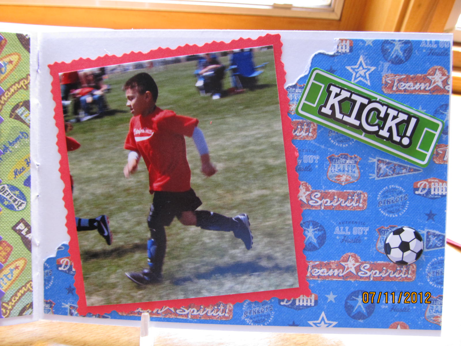
My great nephew, Adrian, played soccer this Spring in a local recreational league. He had a great time and we had an equally great time watching him and his team, The Red Lions.
Since I took a bunch of pictures at the 3 games I attended, I decided to make him a book that I'll give to him for his birthday this fall.
I happened to have a ready made booklet with just the right amount of pages so I used it rather than create and bind my own.
I found a die cut and some soccer themed stickers at the craft stores to help me with this project.
I also happened to have a small tablet of sports-themed paper that made a great background for most of the pages in the book.
I mounted many of the pictures onto colored card stock and then trimmed it with my decorative edge scissors. It was great to use items I've had in my stash for a while.
Some of the pictures are pretty silly, but they indicate what a good time he was having with the team sport and they are fun to look at.
Think how much fun looking at this book will be in about 10 or 20 years!!!
No, Adrian isn't excited because he scored a goal... even though I did use a sticker on this page that might indicate he did. He is a fun loving kid that, like most, is full of energy.
It was fun to see how the kids progressed over the weeks that they played. Most of the kids were just beginners at this sport and didn't know any of the rules.
Adrian really liked to be the goalie. He did get to play that position often. As an early birthday gift we bought him a couple of soccer nets so that he could play in his yard.
I don't think anyone kept score even though there were a couple of referees at each of their games. This was just an opportunity for the kids in his age group to have fun and learn some basics about team sports and soccer in particular.
He is a happy guy. He has soccer shoes, shin guards, and his own ball.
There were times when the game wasn't moving fast enough for the kids... or... they just got too distracted and couldn't focus.
Adrian's first game was a bit chilly, but as the weeks went on the weather improved and the kids didn't have to wear heavy clothes to play.
At times the kids would get all bunched up around the ball. It was a good thing they were wearing shin guards... there was a lot of kicking going on.
The coaches were all volunteers and did a great job. They were patient with the kids and would rotate them in and out of the game so that all the kids on each team got a chance to play.
After the last game they had a little celebration for the kids.
Each team was set up at a table with decorated cupcakes for each team member. Here is the Red Lion team enjoying their treats.
There was no first place or last. Each team member received a metal and each coach received a plague.
And here's our proud soccer player showing off his metal.
Way to go Adrian!!!
Since I took a bunch of pictures at the 3 games I attended, I decided to make him a book that I'll give to him for his birthday this fall.
I happened to have a ready made booklet with just the right amount of pages so I used it rather than create and bind my own.
I found a die cut and some soccer themed stickers at the craft stores to help me with this project.
I also happened to have a small tablet of sports-themed paper that made a great background for most of the pages in the book.
I mounted many of the pictures onto colored card stock and then trimmed it with my decorative edge scissors. It was great to use items I've had in my stash for a while.
Some of the pictures are pretty silly, but they indicate what a good time he was having with the team sport and they are fun to look at.
Think how much fun looking at this book will be in about 10 or 20 years!!!
No, Adrian isn't excited because he scored a goal... even though I did use a sticker on this page that might indicate he did. He is a fun loving kid that, like most, is full of energy.
It was fun to see how the kids progressed over the weeks that they played. Most of the kids were just beginners at this sport and didn't know any of the rules.
Adrian really liked to be the goalie. He did get to play that position often. As an early birthday gift we bought him a couple of soccer nets so that he could play in his yard.
I don't think anyone kept score even though there were a couple of referees at each of their games. This was just an opportunity for the kids in his age group to have fun and learn some basics about team sports and soccer in particular.
He is a happy guy. He has soccer shoes, shin guards, and his own ball.
There were times when the game wasn't moving fast enough for the kids... or... they just got too distracted and couldn't focus.
Adrian's first game was a bit chilly, but as the weeks went on the weather improved and the kids didn't have to wear heavy clothes to play.
At times the kids would get all bunched up around the ball. It was a good thing they were wearing shin guards... there was a lot of kicking going on.
The coaches were all volunteers and did a great job. They were patient with the kids and would rotate them in and out of the game so that all the kids on each team got a chance to play.
After the last game they had a little celebration for the kids.
Each team was set up at a table with decorated cupcakes for each team member. Here is the Red Lion team enjoying their treats.
There was no first place or last. Each team member received a metal and each coach received a plague.
And here's our proud soccer player showing off his metal.
Way to go Adrian!!!
Tuesday, July 3, 2012
Wedding cards
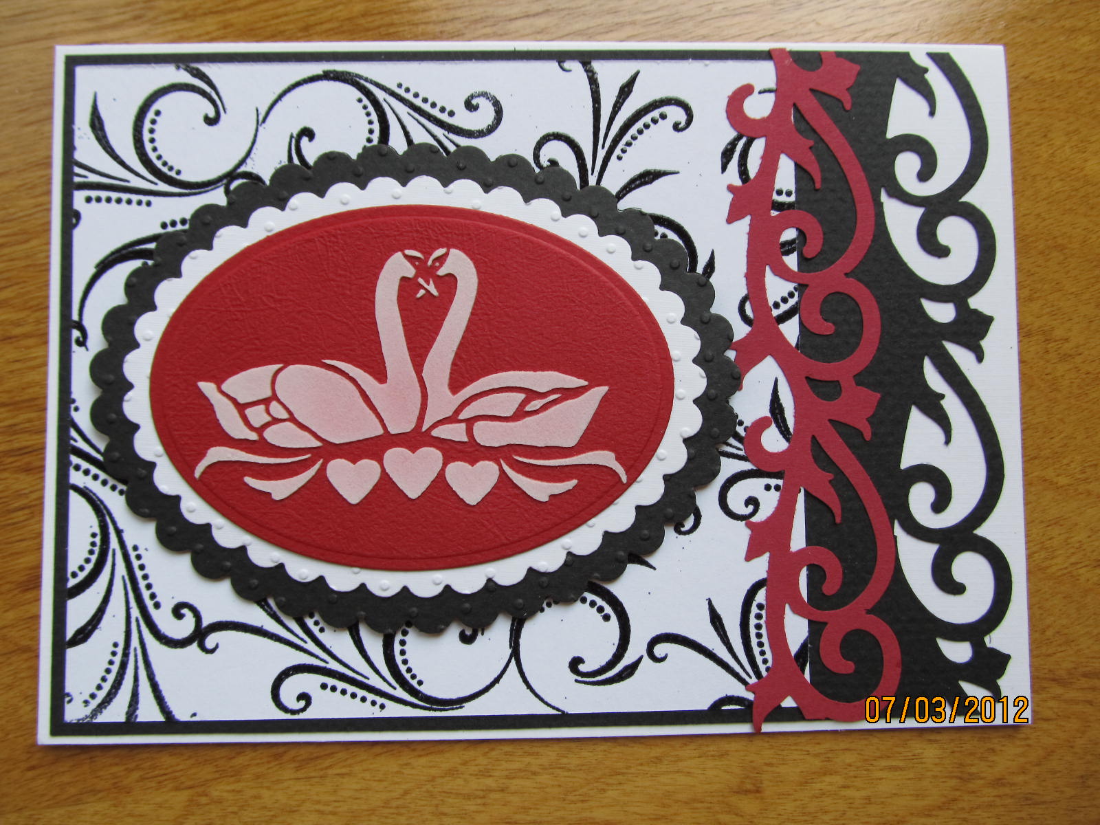
A friend of mine asked if I could make her a wedding card!! Well, I couldn't just make one! I was on a roll, especially after I realized I would need at least 2 cards for myself to give this year. As you can see I used a variety of items: ribbons, flowers, brads, cuttlebug embossing folders, nestabilities dies, webbing spray, stencils and paste, and decorative scrapbook papers.
I had forgotten that I had this great swan stencil. I pulled it out and used silver metallic embossing paste on some of the black card stock pieces and white embossing paste on the others. I found that my metallic embossing paste had become somewhat 'gooey' over time. I don't know exactly how old it is, but I'm guessing about 2 years. I mixed it really well with the palette knife before applying to the surface and it was still a bit gooey and difficult to spread, but once it dried it looked fine.
I love using the EK Success punch that I had purchased in Sayner, WI at 'The Mark-It Place'. It is a 2 in 1 punch that can be used to create a border or used to create a stand alone flourish.
I used another of my EK Success punches on these 2 cards. Check out the cool decorative brads on the top card to the right. They are pearl shaped hearts. I found these in a discount scrapbook store near Pigeon Forge, TN.
I stayed with either the black and white, or red, black, and white theme. These cards will be great for weddings, anniversaries, valentine's day, or even a birthday for that special someone.
The set of stamps I used on these cards is from 'Sweetpea Stamps'. I had almost forgotten I had them! I'm so glad I remembered.
The butterfly is a cuttlebug set of embossing folders and a die. I created the butterfly with 3 layers. The bottom layer is a silver metallic card stock, the middle is a black vellum, and the top is a heart-patterned vellum. All 3 layers were run through the cuttlebug with an embossing plate to create texture.
I liked the butterfly so much I added it to 3 of these cards. The friend who asked me to make a wedding card requested that it be a larger card. Instead of making my usual 5 1/2 x 4 1/4" card I made these to be 7 x 5".
I only have about 2 or 3 verse stamps that would be appropriate for a wedding card and I didn't stamp the inside of any of these yet. I'll wait to see what I use them for and then stamp the sentiment inside.
I had forgotten that I had this great swan stencil. I pulled it out and used silver metallic embossing paste on some of the black card stock pieces and white embossing paste on the others. I found that my metallic embossing paste had become somewhat 'gooey' over time. I don't know exactly how old it is, but I'm guessing about 2 years. I mixed it really well with the palette knife before applying to the surface and it was still a bit gooey and difficult to spread, but once it dried it looked fine.
I love using the EK Success punch that I had purchased in Sayner, WI at 'The Mark-It Place'. It is a 2 in 1 punch that can be used to create a border or used to create a stand alone flourish.
I used another of my EK Success punches on these 2 cards. Check out the cool decorative brads on the top card to the right. They are pearl shaped hearts. I found these in a discount scrapbook store near Pigeon Forge, TN.
I stayed with either the black and white, or red, black, and white theme. These cards will be great for weddings, anniversaries, valentine's day, or even a birthday for that special someone.
The set of stamps I used on these cards is from 'Sweetpea Stamps'. I had almost forgotten I had them! I'm so glad I remembered.
The butterfly is a cuttlebug set of embossing folders and a die. I created the butterfly with 3 layers. The bottom layer is a silver metallic card stock, the middle is a black vellum, and the top is a heart-patterned vellum. All 3 layers were run through the cuttlebug with an embossing plate to create texture.
I liked the butterfly so much I added it to 3 of these cards. The friend who asked me to make a wedding card requested that it be a larger card. Instead of making my usual 5 1/2 x 4 1/4" card I made these to be 7 x 5".
I only have about 2 or 3 verse stamps that would be appropriate for a wedding card and I didn't stamp the inside of any of these yet. I'll wait to see what I use them for and then stamp the sentiment inside.
Subscribe to:
Posts (Atom)